Website design trends
Website design trends are always evolving, and it’s important to keep an eye on what’s hot, and what’s working.
We’ve been checking it out, and there are some good ones!
We’re already almost halfway through 2016, and we’re already seeing plenty of great website design trends that are taking off, that have the potential to increase sales for small businesses.
Card Layouts
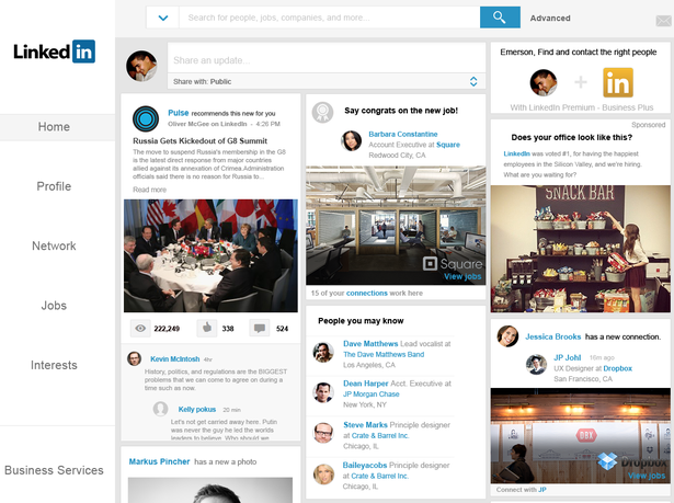
LinkedIn’s card layout.
Want or need to display a lot of information on one page?
The “card” layout was popularized by Pinterest. Just think of a Pinterest board — that’s a card layout design.
This layout trend gives the appearance and functional benefit of being well-organized.
It also makes it easier for content to be rearranged so it can be mobile responsive, or able to be viewed easily on a screen of any size.
It takes advantage of wider screens, allowing more content to be viewed at once.
Out of the newest and best website design trends, this one gets the least amount of recognition.
This is probably because it seems so basic…
…but one of the most important parts of web design is being able to lead the user’s eyes around from the most important or newest content to older or less relevant content.
Mobile Optimized
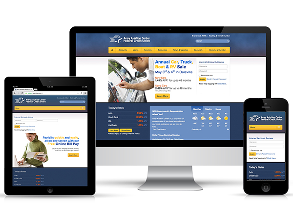
This isn’t so much a trend than an industry standard these days…
…but we’re including it because it’s incredibly important.
When content is viewed on a mobile phone, it’s forced to shrink down, so that all the content is still easily viewed.
That means text needs to be readable, and images need to scale down.
Any good web designer should be able to create a stunning website that will look great on tablets, mobile phones, laptops, and even smart TVs.
This also means displaying content so that it loads easily, which might mean not displaying certain pieces of content on mobile view.
Non-essential content that gets left out of smaller screen views are…
- Javascript animations
- CSS animations
- Large site menus (these are instead displayed as a drop-down)
When a mobile optimized layout is viewed on mobile view, the most important, relevant and newest content are included and put front and center.
The importance of mobile friendly design has also dictated a lot of other recent website design trends.
Explainer Videos
Explainer videos take advantage of the fact that viewers love videos.
These are used to give the visitor a quick run-down of a service, product, brand, etc., in a fun and entertaining way.
This type of content and design hybrid is highly effective in converting traffic.
Of course, you should still have text on the page to back up the video, just in case the video doesn’t load for the viewer.
In the past, video wasn’t integrated quite as much into design and content.
These days, many people have access to high speed internet, so it’s much less of an issue.
And this year, it’s gaining A LOT of traction and proving how well video works in making sales online.
One major trend in these videos, are the types of designs and animations…
Cute, cartoonish designs are popularly used in explainer videos, with simple animations that move fast and present the subject matter in a fun way.
Explainer videos are short — no more than about 3 minutes long.
These videos have one main objective that they meet in spades: They keep the reader’s attention!
Check this one out as an example:
<iframe width=”1280″ height=”720″ src=”https://www.youtube.com/embed/9wYLaKFGpBA?rel=0″ frameborder=”0″ allowfullscreen></iframe>
“The 7 Phase Web Design Process with CIRIUS Marketing”
And what better way to display a product than to show it in action?
For many products, being able to see it from many angles or to see how it works is necessary.
For others it might not be necessary, but it will cause your sales to climb nonetheless.
As we said before, video is taking over.
A video is much quicker and easier to digest, and you want to make everything super easy for a potential buyer.
If you’re selling a service instead of a product, you can still apply this concept.
On any product page or landing page, a video of you speaking to your customer will always convert better than static images and text.
Jumbo Background Images
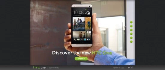
This was HTC’s website.
Big background images used in web design are eye-catching and give the user a more “alive”, three-dimensional experience.
These large images often stretch all the way across the page.
They also feature text or buttons, which are emphasized because of their importance.
Jumbo background images are high quality, and are sometimes darkened or lightened, so that the text or other content will stand out more.
These are great when used to…
Draw the eye to a call-to-action (Buy now! Sign up!)
OR
Announce the atmosphere or theme of a website or particular page.
Sometimes, these background images can scroll around as a slideshow, so the user can see more relevant and important content.
These are also called “hero images”.
Video Background
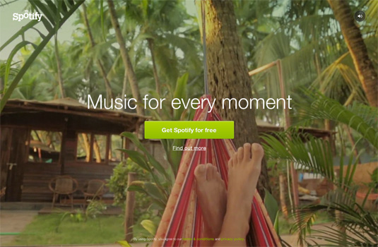
Click here to see Spotify’s animated background in action.
Video backgrounds have the same basic idea as jumbo background images.
They draw the eye, and give the user a unique experience, only on a totally different level.
The computer screen comes to life, and they can see a presentation or watch a story unfold that gives them a good understanding of your brand.
Plus, it looks impressive.
The one downside to video backgrounds? They often have to be taken out of the mobile view.
Since the screen is smaller, the video would need to shrink down too much to be able to be viewed properly.
Single-Page Sites
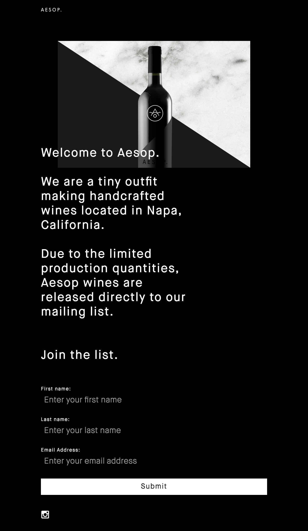
Aesop Wines
We’re sure you’ve come upon a website that had no other pages to click on, it was just one page that scrolled down.
If there did happen to be links, they would just quickly jet you down to a certain section of the page.
This is one of the website design trends that definitely isn’t for everybody.
Many sites require many, many pages. In that way, a single scrolling page just isn’t feasible.
A single-page website is best dedicated to funneling visitors toward one specific goal.
Here are some examples…
- A “curriculum vitae” website, or portfolio to get people to hire you.
- A website dedicated to one special product or service.
- Any other instance when you truly don’t have a lot of content that needs to be displayed.
The beauty of this situation is that this can be changed fairly easily.
If your business grows, however, you can have your website changed over to being composed of multiple pages.
These website designs trends are trends because they not only look nice, but they fulfill a very important need…
…they work to help increase sales!
Are you thinking of incorporating any one of these trends into your own small business website?
You can take the DIY approach and design your own with a drag ‘n’ drop website editor
(Read all about those in our review of our favorites!)
If you’re not doing it yourself, get it so you can hand it to your web designer!
No matter which of these website design trends you incorporate into your business website, you’ll need to make sure your offers are positioned properly.
Your website needs to pull its own weight.
Even the layout of your website has to lead your visitor to opt in to your subscriber list, or make a purchase.
Don’t reinvent the wheel! Download the Perfect Homepage Template.
