

High-converting product pages aren’t born — they’re built. And if you’re still treating your product page like a digital shelf tag, well, your customers can spot that from a mile away. In 2025, your product page isn’t just a pretty face; it’s a full-blown salesperson working 24/7 — and it better know how to close.
So let’s break down exactly what goes into a product page that doesn’t just sit there but actually sells.
Start with a compelling, benefit-driven headline
Forget “Men’s Cotton T-Shirt.” Nobody cares. Your headline should scream benefit, emotion, or transformation in under 7 words. Think:
- “Stays Soft Wash After Wash”
- “Built to Survive Monday Mornings”
- “Feel-Good Fabric That Breathes All Day”
It’s a billboard moment — don’t waste it on a product name alone.
Use a subheadline to double down on confidence
Right below that bold headline, add a subheadline that tackles a specific hesitation or adds social proof.
- “Trusted by 10,000+ happy customers”
- “90-day money-back guarantee — no questions asked”
- “Ships free, always”
These confidence boosters calm the shopper’s lizard brain, so they can keep scrolling instead of bouncing.
Bullet points that sell benefits — not specs
Most product pages drown you in dimensions and materials. Cool, but what do those details do for me?
Instead of:
- “100% polyester
- ”Say:
- “Wicks sweat to keep you dry, even on the hottest days”
Benefits connect to feelings, and feelings drive purchases.
Inject an emotional hook
Remember, people buy for emotion first, logic second. So anchor your product page with a relatable hook:
- “No more scratchy, stiff tees — just softness you’ll want to live in.”
- “Never worry about awkward sweat stains again.”
- “Upgrade your weekday wardrobe in 5 seconds flat.”
This language makes the customer see themselves in the story — not just the shirt.

Social proof is your conversion wingman
If you say it, it’s marketing. If they say it, it’s proof.
- Showcase a star rating near the headline
- Include a customer quote or testimonial block
- Feature trust signals like “#1 Bestseller” or “As seen in [media]”
Humans follow humans. A product page without social proof is like a date who talks only about themselves — no one’s buying it.
Layer on trust elements
A guarantee, returns policy, and secure checkout icons shouldn’t be hidden somewhere in the footer — bring them up top. Trust is a conversion multiplier, but only if shoppers can see it.
- “Risk-free returns for 30 days”
- “Safe checkout with Shopify Secure”
- “100% satisfaction guaranteed”
Put these front and center to quiet those “what if” doubts before they even start.
Design with flow, not chaos
If your product page looks like a yard sale — flashing badges, neon banners, random testimonials — people will bounce. Your structure should guide the eye:
- Headline →
- Subheadline →
- Star ratings/social proof →
- Images →
- Benefit bullets →
- CTA
One smooth story, no distractions.
Calls to action that feel personal
“Add to Cart” is fine. But “Get Yours Today” or “Snag This Deal” feels more human, more fun, more you. Even better: test multiple CTAs. On high-converting product pages, small CTA shifts can add up to big sales.
Recap: your conversion checklist
If nothing else, remember this quick gut-check for every product page:
✅ Does my headline make a promise?
✅ Can customers see trust signals immediately?
✅ Do my bullets talk benefits, not specs?
✅ Did I use social proof?
✅ Is the CTA clear and motivating?
If you can check all five, you’re already ahead of 90% of Shopify stores.
Using Images and Video for High-Converting Product Pages
Your words can do a lot, but let’s be real — visuals seal the deal. On high-converting product pages, the right images and videos turn “Hmm, maybe” into “Where’s my wallet?” faster than any bullet point ever could.
People don’t just want to read about your product; they want to see it, feel it, and imagine it solving their problems. Great visuals make that happen. Here’s how.
Lifestyle photography over stiff studio shots
Look, a flat-lay on a white background is fine for Amazon, but Shopify shoppers crave lifestyle. They want to see:
- A candle burning on a cozy shelf
- A shirt in action at brunch
- A face serum on real skin
These lifestyle images give context, make your product relatable, and answer the question every shopper has: “Is this for me?”
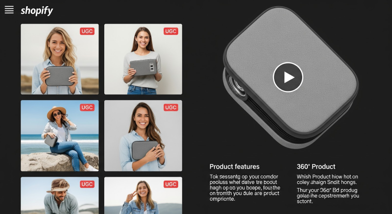
Use user-generated content as social proof
User-generated photos or video reviews are trust gold. When customers see real people — not models — using your product, it feels authentic. Plus, UGC is proven to boost conversion rates because it comes with a built-in testimonial: “This worked for me, so it might work for you.”
Encourage your customers to tag you, then repurpose their best shots. Frame them like mini reviews.
360° views and zoom features = confidence
People can’t touch your product online, so give them the next best thing.
- 360° product viewers let them spin it like a sneakerhead flexing new kicks
- Zoom features let them examine stitching, patterns, finishes, or ingredients
Nothing says “trust” quite like letting a shopper poke around every angle, no surprises.
Short explainer videos for the win
Think of a 15–45 second video like your digital elevator pitch. Show the product in use, highlight a key benefit, and close with a quick call to action.
- Unboxing clips
- Quick how-tos
- Transformation demos (“before and after”)
Pro tip: add captions. Most shoppers scroll with the sound off, so make sure your video still sells silently.
Visual hierarchy is your silent sales coach
If your visuals are chaotic — crammed, off-center, or competing for attention — you’re just overwhelming the buyer. Use hierarchy:
- One hero image first
- Secondary images that support the story (UGC, lifestyle, alternate angles)
- Then video for the final nudge
This flow pulls the shopper deeper, guiding their decision rather than distracting them.
Highlight trust visually, not just with text
If your product is organic, cruelty-free, handmade, fair-trade — show those badges. Place them on lifestyle photos, near your CTA, or on your secondary images. Visual trust beats a wall of copy every time.
Compress, compress, compress
Great visuals are useless if they tank your load speed. High-converting product pages balance sharp images with lightning-fast performance.
- Use .webp formats
- Compress under 150 KB where possible
- Test on 4G networks to catch slow-loading assets
A pretty page no one waits for? That’s a page that doesn’t convert.Wrap it all up with consistency
Every photo, every video, every thumbnail should speak your brand language. Consistent colors, consistent editing, consistent tone. That’s how a product page feels polished and pro — even before a single line of copy is read.
Writing Copy That Powers High-Converting Product Pages
Good copy is like a great bartender — it listens, connects, and makes you feel like this is the best place to spend your money. On high-converting product pages, the words you choose are what push shoppers off the fence and into checkout.
Here’s how to make your product page copy do its job like a pro.
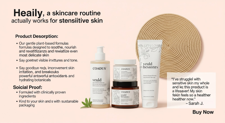
Start with the customer’s pain points
Nobody wakes up thinking, “I need a new face serum.” They wake up thinking, “My skin looks dull, I feel tired, I’m sick of wasting money.”
Lead with that. Name their problem. Show you get it. When someone reads your copy and nods, you’ve already started the sale.
Flip features into benefits
Specs are nice. Benefits sell.
Instead of:
- “Contains Vitamin C”
Say:
- “Brighter, smoother skin in 7 days — thanks to dermatologist-grade Vitamin C.”
Benefits explain why the features matter. And customers buy why.
Tell a story (hello, e-commerce product storytelling)
Don’t be afraid to give your product a backstory. People want a reason to care.
- “We created this after testing 11 failed formulas.”
- “Inspired by customers who asked for a truly scent-free option.”
- “Handmade in small batches so you never get a stale product.”
Stories build connection. Connection builds trust. Trust builds sales.
Use relatable, emotional language
No one falls in love with “moisture-wicking fabric technology.” They fall in love with:
- “No more sweat patches, ever.”
- “Feels like a hug on your hardest days.”
Talk like you would in person, not like a corporate robot. If it sounds too formal, rewrite it until it feels human.
End with a bold, confident call to action
Don’t shy away from the close. Your page’s final lines should make the buyer feel excited, not pressured.
- “Get yours before they’re gone.”
- “Start your glow-up today.”
- “Claim your risk-free trial.”
A strong CTA = the finish line of your persuasive story.
Mix in trust language
Sprinkle in trust language wherever you can:
- “30-day money-back guarantee”
- “Trusted by over 5,000 happy customers”
- “Safe checkout with encrypted security”
When the mind starts second-guessing, trust language brings it back to yes.
Keep paragraphs short and scannable
Nobody is reading your product page like a novel. They’re skimming. Respect their time:
- Use short sentences
- One idea per paragraph
- Plenty of bullet points
- Bold where emphasis helps
If they can understand your entire pitch in 30 seconds, you’ve won.Pro tip: test your voice
The best high-converting product pages match your brand personality. Are you cheeky? Warm? Premium? Once you write your copy, read it out loud. If it feels awkward, rewrite until it flows like you’d actually say it.
Building Trust on High-Converting Product Pages
Trust isn’t a nice-to-have on your product page — it’s everything. Customers might love your photos, drool over your bullet points, and dream about your benefits, but if they don’t trust you? They will not click “Buy Now.”
Let’s fix that.
Guarantees and risk-reducers calm buyer nerves
Your customer is always asking, “What if it doesn’t work out?” It’s your job to answer that before they even finish the thought.
Include guarantees front and center:
- “30-day money-back, no questions asked”
- “Free exchanges, even if you change your mind”
- “Try it risk-free for 14 days”
These statements make hitting “Add to Cart” feel like a safe bet, not a scary leap.
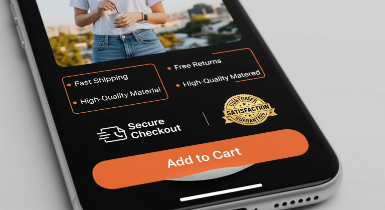
Secure checkout icons seal the deal
Don’t hide your trust signals in the footer. Place security icons right next to your call to action:
- Verified payment badges
- SSL certificate symbols
- Trusted checkout logos
A simple line like “100% secure checkout — your info is safe” is sometimes all it takes to reassure a hesitant customer.
Free shipping & returns = instant confidence
This one’s huge. Modern shoppers expect it.
- Highlight “Free Shipping” boldly
- Reinforce “Easy, free returns”
It lowers the risk in their mind — “If I hate it, at least I won’t pay to send it back.” That tiny sense of safety is what unlocks conversion.
Feature customer reviews as mini-stories
Star ratings are great, but a quote from a customer? That’s gold.
- Share quick quotes: “I was skeptical, but this changed my life.”
- Add photos next to reviews
- Pull out a highlight and bold it, like a newspaper headline
A review feels like a friend talking. That’s 10x more persuasive than your own marketing voice.
Badges and certifications build instant credibility
If you’re organic, cruelty-free, recycled, handmade, anything — show it. People trust badges way more than they trust a random claim in your paragraph.
- Organic Certified
- Carbon Neutral
- Made in the USA
Visual signals are shorthand for “yes, this brand is legit.”
Show trust above the fold
Don’t bury your guarantees, reviews, or trust badges below three miles of text. If a customer has to scroll to discover why they can trust you, you’re missing conversions.
Above the fold = top of the page, near your images, near your price, near your button.
Build trust with transparent language
Here’s a pro move: if you’re honest about flaws, customers trust you more.
- “Runs slightly large, order down if between sizes.”
- “May take 2–3 wears to break in.”
It shows you aren’t just hyping — you care. And nothing feels more authentic.
Trust is an emotion, not a feature
At the end of the day, no badge or guarantee will fix a shady vibe. Your entire tone — visuals, layout, copy — has to feel human, honest, and real. That’s how high-converting product pages transform from a “maybe” to a “yes.”
If your page feels too slick, too hyped, too pushy, it kills trust. Keep it sharp but human. That’s the magic.
Optimizing High-Converting Product Pages for Mobile
It’s 2025. If your product page only looks good on a laptop, you’re basically ignoring half — maybe more — of your buyers. High-converting product pages need to be designed for thumbs first, because mobile shoppers are the ones buying on the go, at red lights (don’t judge), or in bed at midnight.
Here’s how to make sure you’re crushing mobile conversions, not crushing your customers’ patience.
Sticky add-to-cart buttons are your MVP
Mobile shoppers scroll. A lot. If your “Add to Cart” button floats away and disappears halfway down the page, that’s revenue out the window.
Use a sticky CTA — something that stays pinned to the bottom of their screen — so they can tap “Buy Now” the moment they feel the itch.
Prioritize speed like it’s survival
No one waits for a product gallery to load on their phone. If your images aren’t optimized for fast delivery, you’re going to lose buyers to the back button.
- Compress images under 150 KB
- Use modern file formats like .webp
- Lazy-load secondary images
Fast page = more conversions. It’s that simple.
Design for one-thumb action
Your layout should be easy to navigate with one hand. That means:
- Buttons big enough to tap
- Padding so fingers don’t hit the wrong link
- Headlines short enough to read without zooming
A gorgeous desktop design is useless if a mobile user can’t tap through comfortably.
Keep your mobile hierarchy crystal clear
Don’t cram everything above the fold on a tiny screen. Instead, guide the shopper like a story:
- Big hero image
- Benefit-driven headline
- Trust signals (like star ratings)
- Sticky CTA
- Supporting details further down
That hierarchy feels natural on a scroll.
Tap-friendly image zoom
Your customers still want to examine quality — especially for fabrics, finishes, or fine details. Add tap-to-zoom on mobile galleries, so they don’t have to pinch and squint.
Use quick-scan bullet points
Mobile shoppers are skimmers. Serve them easy-to-read bullets:
- Benefits over features
- Fast shipping notes
- Guarantees
- One-sentence testimonials
Nobody wants to read dense paragraphs on a 6-inch screen.
Simplify, then simplify again
Your mobile product page should cut out every unnecessary distraction. Ditch:
- Pop-ups that cover the CTA
- Heavy carousels with 12 slides
- Endless tabs that load separate pages
If it doesn’t help the shopper convert, kill it.
Test it with real hands
Sounds obvious, but too many brands never do this: actually put your phone in your hand, load the page, and shop your own store. Tap through the journey like a real customer.
Ask yourself:
- Can I read everything easily?
- Is the CTA always close by?
- Did the images load before I got bored?
If the answer is no, fix it before you run a single ad.
Trust elements belong on mobile too
Don’t assume customers will go hunting for your trust badges or guarantees. Place them clearly under the CTA or near product highlights. Even better? Stack a quick testimonial above the button.
Final tip: match your desktop energy
Mobile shouldn’t feel like a watered-down version of your store. It should feel identical in voice, vibe, and clarity. Shoppers should never feel like they’re missing out on the experience just because they’re on their phone.
A high-converting mobile product page is just your best salesperson — pocket-sized.
Testing High-Converting Product Pages for Performance
Think of your product page like a first draft. You wouldn’t publish a book without an edit, right? Same goes for high-converting product pages. You test them, tweak them, and then test them again until they hum along like a cash-printing machine.
Here’s how to do it smart, not sloppy.
Start with the right KPIs
You can’t improve what you don’t measure. For product pages, your best metrics are:
- Bounce rate
- Time on page
- Scroll depth
- Add-to-cart rate
- Conversion rate
These numbers don’t lie — they tell you exactly where people are bailing, where they get stuck, or where they get sold.
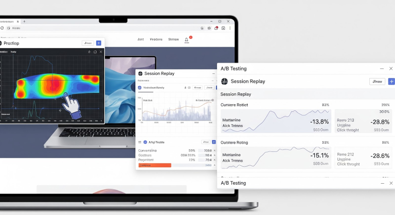
Use heatmaps like a mind reader
Heatmaps are your product page’s crystal ball. They show you:
- Where people click
- Where they hover
- Where they completely ignore
If nobody ever scrolls to your guarantee, you know to pull it higher. If the “Add to Cart” button is too far down? That’s money left on the table.
Session replay tools are your best friend
Watching real customer journeys feels creepy, but it’s conversion gold. Session replays show you how real people interact with your product page:
- Did they rage-click a broken button?
- Did they scroll forever looking for details?
- Did they abandon after reading your returns policy?
One afternoon of session replays can give you a month’s worth of actionable insights.
Run A/B tests constantly
Your first version is never your final version. A/B testing lets you pit one product page against another to see what actually works. Test things like:
- CTA button text (“Buy Now” vs. “Get Yours”)
- Product photos (lifestyle vs. studio)
- Headline angles (emotional vs. factual)
- Review placement (above vs. below fold)
Pro tip: test one element at a time so you know what made the difference.
Get customer feedback, not just data
Data is amazing. But sometimes what a customer says is worth more than any spreadsheet. Add a quick post-purchase survey:
- “What almost stopped you from buying?”
- “Was anything missing from this product page?”
They’ll tell you exactly what to fix.
Set up long-term tracking, not one-off tests
Some brands test once and call it a day. That’s not how high-converting product pages stay ahead. Set up an ongoing feedback loop:
- Weekly KPI reviews
- Quarterly redesign reviews
- Seasonal re-tests tied to traffic spikes
Your product page should evolve with your customers.
Don’t test just for conversion — test for trust
It’s easy to chase raw conversion rates and forget about your brand. Always ask:
- Is this urgency tactic still honest?
- Is this design still on-brand?
- Are these reviews still authentic?
Conversion is great, but sustainable brand trust is what brings customers back.
Iterate like your business depends on it (because it does)
Small, consistent tweaks beat one big redesign every time. Your product page isn’t a one-and-done — it’s a living, breathing sales tool.
Keep asking:
- Can I make this easier to scan?
- Is the language more human?
- Are the visuals still fresh?
The moment you stop improving is the moment your competitors catch up.
How Cirius Creates High-Converting Product Pages for Shopify Brands
You’ve seen what makes a killer product page — now let’s talk about how to pull it off without losing your mind (or your customers). Cirius specializes in turning “meh” product pages into confident conversion magnets that look good, sound good, and sell even better.
Here’s how we do it.
We start with a complete product page audit
Before rewriting a single headline, we break down what’s already there:
- Does it have a hook that grabs?
- Are there trust signals in the first scroll?
- Is the imagery telling the right story?
- Does the copy focus on benefits or boring specs?
No fluff — just an honest assessment of where your product page stands today.
Then we build the story that sells
Every high-converting product page deserves a story that makes people care. We help you script it by:
- Interviewing your team or founder for the brand’s why
- Mapping out your hero product’s problem-solution arc
- Writing copy that answers why you? instead of so what?
Because when people believe in your story, they believe in your product.
We design with hierarchy, not chaos
We see it all the time — CTAs in weird places, benefits buried five scrolls down, trust badges hidden in footers.
Our design team fixes that by:
- Leading with bold benefit-driven headlines
- Placing CTAs consistently and predictably
- Wrapping trust elements around the button (not miles away)
- Using clear visuals that match your voice
It’s structure, but with style.
We build mobile-first, every time
If your product page tanks on mobile, you’re done. That’s why our designers test mobile layouts first, from thumb reach to sticky buttons to tap-to-zoom image galleries.
Desktop still matters — but mobile is where the money is.
We integrate social proof like a conversion supercharger
Cirius helps you:
- Collect authentic UGC and customer photos
- Organize testimonials like mini-stories
- Highlight 5-star reviews in your bullet lists
- Add “people also bought” to drive confidence even further
Social proof is your product page’s hype squad — it deserves a starring role.
We engineer speed and smooth UX
Pretty pages that take 5 seconds to load are dead on arrival. So we:
- Compress images to load instantly
- Optimize code for Shopify’s best practices
- Test pages on 4G (yep, even if it feels old-school)
- Prioritize content hierarchy for quick scanning
Because a high-converting product page is useless if nobody waits around to see it.
We wire in tracking and test like mad scientists
Your product page should never be “set it and forget it.”
Cirius sets up:
- KPI dashboards (bounce, add-to-cart, conversion rate)
- Heatmaps and click tracking
- A/B test plans for everything from headlines to button colors
- Session replays to catch user frustrations
Then we actually read the results and help you act on them.
We measure trust, not just clicks
Sure, you want a higher conversion rate. But you also want a stronger brand. So we ask:
- Does this still feel authentic?
- Does this match your brand’s tone?
- Would you buy from this page?
Because we’re not in the business of short-term hacks — we build pages that perform today and tomorrow.
Client results that prove it works
One Cirius client had a pretty product page that didn’t convert. After an audit, redesign, and copy rewrite, they saw:
- 38% more add-to-carts
- 26% higher conversion rate
- Customers calling out the story in their reviews
- Higher repeat purchase rates
That’s what happens when you blend brand story, trust, and strategic urgency — in a page that’s actually fun to shop.
What you get with Cirius
- Full page audits with zero jargon
- Story-driven product copy
- Clean, conversion-tested page design
- Mobile-first layouts
- Tracking + testing plans built in
- Confidence (because you’ll know why it’s working)