There are an almost-infinite number of well-written “best practice” articles on the subject of form design that focus on usability, layouts, and length.
These articles tend to dive deep into UX tactics to increase form completion. While these tactical recommendations are an important piece of the puzzle, these articles often neglect to provide a larger strategic framework around the design of the form itself. Before one even gets to the form layout and interaction design, one must consider the nature of the form itself.
In other words, why would a user fill it out in the first place?
A form is a transaction. You are asking the user to take time out of their day to provide information to you. Like any transaction, either digital or physical, there are criteria that a person must consider before engaging.
So how do we introduce this concept into the design of our forms? Two primary factors to form completion are:
- Brand reputation
- What the user gets in return
Form length, while an important consideration, is only one part of form design: imagine if Apple had a 50-page form and the user received a free iPad upon completion; that form would have astronomical completion rates. And why is that? Because Apple is a reputable company and they are offering a valuable product in exchange.
That’s a great deal, and it would be worth the user volunteering their time and information.
Have you ever designed for a client who wants every single detail about the user for a registration or contact form? They ask for the person’s name, email, phone number, date of birth, employer, position, salary rate and shoe size, and every field is required. Then they are shocked when the completion rates are low.
That’s when we have to step up as consultants, helping clients see from the user’s perspective and not just what’s in it for them.
What’s your reputation?
You might be designing for a large company with an established brand name. In these cases, many years and millions of dollars in marketing have created an implied trust, so a user might be more comfortable giving a little more information.
However, if you’re a startup or otherwise unknown organization, the user might be more apprehensive about volunteering their information. Your design will have to account for this.
What can you offer?
Access
Many of the flash sale sites, like One Kings Lane, require an email address just to browse the site.
As a user, you can’t even see the products unless you give up your email address. It’s worth it to many people in this case, as a few extra emails in your inbox each week are worth the price of admission to see the deals on offer.
More full-featured applications require registration to use the product.
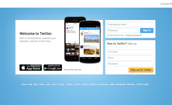
Take Twitter’s registration form, they ask for your full name, email, and password. In exchange, they offer direct access to a global community of over 600 million people, including celebrities, business leaders, politicians, and gurus of every stripe. Three pieces of information in exchange for all that? Done.
What are you asking for, and what are you offering in return?
It’s likely that you won’t have the same value proposition as Twitter. If you are a new startup with few users and you are trying to get people to sign up for your app, it’s in your best interests to limit what you ask for, as the user might not see the value of the service in the same way you do.
A digital product
Other companies and services also offer something more direct in exchange for information.
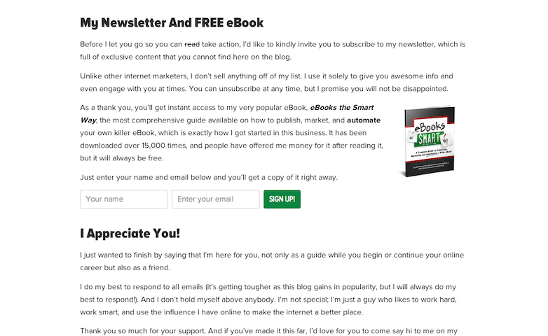
Here, passive income blogger Pat Flynn wants users to sign up for his newsletter.
He is a very popular blogger, but not necessarily a well-known brand. That said, knowing how important it is to build an email list for his site, he offers his ebook free when the user signs up. This might convince a user interested enough in the subject matter to sign up for the newsletter if they were undecided about getting yet another email in their inbox from a source they don’t know if they can trust.
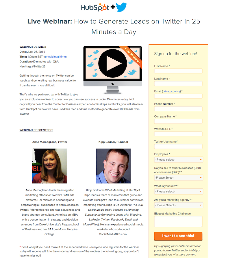
Hubspot is a thought leader in online inbound marketing.
Here, they offer a free “On Page SEO Template” as a download if the user fills out the form on the right of the page. In this case, they ask for quite a lot of required information. They can do this because they are a very reputable company in this space and they are offering a valuable tool in exchange.
One could offer white papers, podcasts, videos, email newsletters, presentations, and webinars, to name a few.
Free Samples & Giveaways
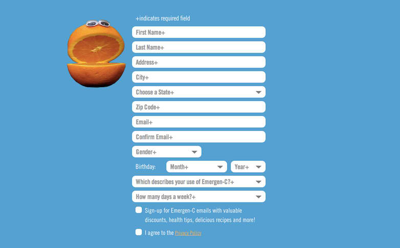
People love their free stuff. By sending customers a free sample, Emergen-C can ask for quite a lot of information on their Facebook page, including the user’s physical mailing address. People will likely volunteer this information if they have heard of Emergen-C, and want to try some at no charge.
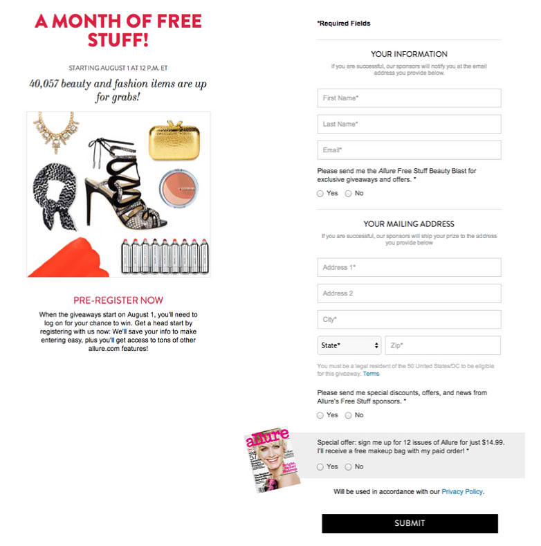
Same goes here for Allure.
This brand has a large following of fashion conscious readers. By offering giveaways of high-value merchandise, they can in turn ask for high-value information from their readers. That said, it seems like they could ask for more information here without much negative effect on the completion rates given the value of what they are offering.
Would you complete the form you’re designing?
This is a good jumping-off point when designing the form.
Ask yourself if you would complete this form if you were to encounter it in the wild. If you are designing for a client where the end user is someone wildly different than you, try and put yourself in the user’s shoes. Would you do it then? Why or why not?
Unfortunately, there is no magic formula for designing forms.
Think about it, decide if what you’re offering your audience is valuable enough to warrant the amount of information you’re asking for, and ideally A/B test your assumptions when the form is launched. But the most important thing is to ask yourself, “Why would a user complete this form?” and go from there.
Written by Jeremy Belcher
Recommended Reading: What Leads Are and How To Use Them to Your Advantage
