
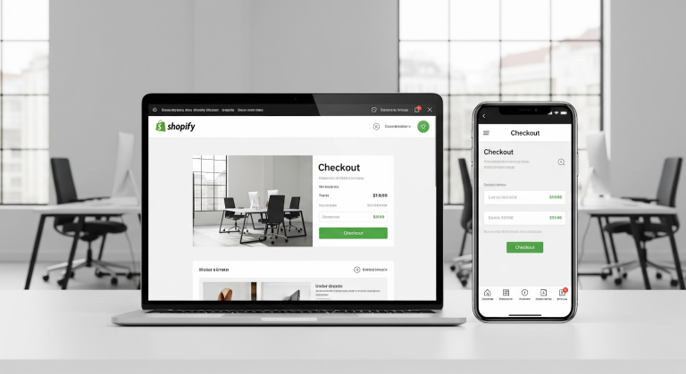
If you think a Shopify checkout is “set it and forget it,” let me burst that bubble before it costs you more revenue than you want to admit. Shopify checkout optimization is the difference between a funnel that finishes strong and a funnel that springs leaks right at the finish line.
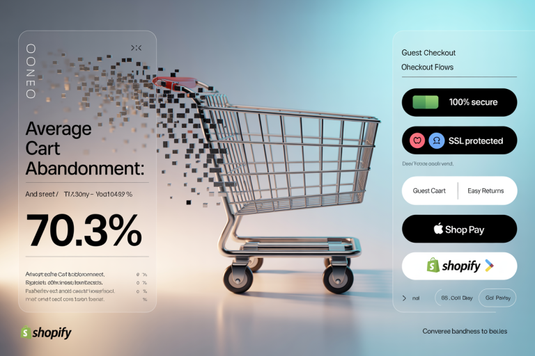
It’s brutal but true: your checkout is where most revenue gets won or lost. We’re talking 70% average cart abandonment across e-commerce — that’s not a scary story, that’s a statistic. Shoppers drop out because they hit a wall of confusion, friction, or mistrust right when they’re most ready to buy.
Think of it like this: you’ve warmed them up, romanced them with your product pages, made them want what you’re selling — and then they slam into a clunky, slow, suspicious checkout flow and vanish. That’s like dropping your date off at the restaurant door and then forgetting to open it.
Why does Shopify checkout optimization matter so much?
Because the checkout is the final handshake. It’s the yes. And if you fumble that moment, every click, every ad dollar, every social post, every beautiful hero image before it? Wasted.
Here’s why you cannot ignore it:
1. Cart abandonment is sky-high
- The Baymard Institute pegs average abandonment at 70%+
- Every single barrier in your checkout increases drop-off
- Even minor annoyances — like too many fields or forced account creation — can cost you sales
2. Tiny fixes = big revenue
- Removing just one field can lift conversions
- Showing a trust badge can bump confidence
- Adding a one-click payment option can cut completion time by half
Those tiny tweaks compound into massive gains because checkout is the place where customers already want to buy — you’re just removing the final hurdles.
3. Checkout is the last (and most crucial) funnel step
Picture your funnel like a relay race. The checkout is your anchor runner. All the marketing efforts before it — the ads, the organic traffic, the brand-building — hand the baton to checkout.
If checkout drops it, you lose the race.
What makes people bail at the last second?
- Distrust (site looks sketchy, payment doesn’t feel secure)
- Hassle (too many fields, bad mobile layout)
- Surprise fees
- Slow load times
- No guest checkout
All of these triggers stack up and drive cart abandonment through the roof.
So what’s the solution? Shopify checkout optimization.
It’s not about slapping on another plugin or switching up your button color once. It’s a system:
- Simplify fields
- Build trust visually
- Make payment brain-dead simple
- Show guarantees and familiar logos
- Test, track, and keep improving
In short: you remove friction, build confidence, and speed people through to “yes.”
That’s what Shopify checkout optimization is all about.
It’s not a cost, it’s an investment.
Because if you can take even a small slice of those abandoned carts and pull them back in, the ROI is massive. A single percentage point lift in checkout completion can mean tens of thousands of dollars in new revenue over a year — depending on your store size.
If you want to build a checkout that’s more Formula 1 pit stop than DMV line, this is your playbook.
Let’s do it.
How to Simplify Shopify Checkout Optimization for Better Flow
Shopify checkout optimization isn’t just about fancy scripts or third-party plugins — it’s about making the path to “pay” as clean and frictionless as possible. The simpler the checkout, the higher the conversions. Period.
Think about how you buy in real life: do you enjoy twenty steps to pay for a latte? Nope. Neither do your customers when they shop online.
Here’s exactly how to simplify your Shopify checkout flow — and why that simplicity is the real superpower.
1. Reduce form fields
One of the biggest killers of conversions is a checkout that looks like a government application form. Every extra field creates hesitation.
Ask yourself:
- Do you really need a phone number?
- Could you skip company name?
- Do you need separate billing and shipping if they match?
If it’s optional, drop it. If it’s nonessential, kill it. Fewer fields = fewer reasons to abandon.
2. Enable guest checkout
If you force account creation, you’re basically telling customers, “We’d rather have your data than your money.” That’s not the vibe.
Guest checkout is a must. People are in a hurry, they don’t want to create passwords they’ll forget in 30 seconds, and they definitely don’t want to get stuck on an account confirmation email loop.
3. Use auto-fill wherever possible
Modern browsers and Shopify itself can auto-complete shipping, payment, and address fields. Let them.
Every second you shave off the form completion is money in the bank.
4. Simplify the page flow
Should you do multi-step or single-page? Here’s the answer:
- Single-page is faster, especially on desktop
- Multi-step works if you chunk it clearly, with a progress bar
No matter which you pick, don’t hide surprises. Let customers see totals, taxes, shipping options, and discount fields right away. Surprises are great for birthdays, terrible for checkout.
5. Avoid upsell overload mid-checkout
Look, upsells are amazing — but timing matters. If you bombard customers with five add-ons during checkout, you’ll destroy momentum.
Save big cross-sells for confirmation pages or post-purchase emails. At checkout, micro-upsells (“Add a warranty?” or “Gift wrap?”) work if they’re single-click and non-intrusive.
6. Keep the design crisp
Think of your checkout as a quiet place.
- No flashing banners
- No sidebars fighting for attention
- Clean typography
- Obvious buttons
The fewer distractions, the more confident people feel — and confidence leads to conversions.
7. Pre-fill wherever you can
If a returning customer is logged in or remembered by cookies, pull in their shipping details automatically. “Wow, they remembered me!” is a trust builder and a friction destroyer.
8. Clear CTA buttons
Make your pay button unmissable. No tiny grey text. Go bold:
- “Complete My Order”
- “Place Secure Order”
- “Pay Now”
And keep it consistent. If your button says “Continue” on one step and “Buy Now” on another, that subtle switch can create hesitation.
9. Remove unnecessary friction
If you haven’t run a friction audit, do it now:
- Are there error messages that confuse people?
- Does the “apply discount” button work seamlessly?
- Do users get stuck on shipping selections?
Anything that can break the checkout flow needs to go or be reworked.
Shopify checkout optimization is about flow, not flash. It’s about getting someone from “I’m interested” to “I’m in” as quickly and comfortably as possible.
Simplify every field, every step, every word. Because your customer’s best experience is the one where they don’t even notice the experience — they just buy, effortlessly.
Speed and Mobile-First Shopify Checkout Optimization
If you’re ignoring speed and mobile flow, you’re basically lighting your Shopify revenue on fire. Seriously. Because Shopify checkout optimization lives or dies on the tiny screen, in the palm of your customer’s hand.
These days, mobile traffic rules the e-commerce universe — but most cart abandonments still happen on mobile. Why? Because checkout feels clunky, slow, and impossible to navigate with a thumb.
Let’s fix that.
1. Prioritize lightning-fast load times
Mobile shoppers have no patience. Every extra second of load time equals more drop-offs — period.
How to speed things up:
- Compress all images below 150KB
- Ditch scripts you don’t absolutely need
- Cut back on third-party apps
- Test on a real mobile network (not just office Wi-Fi)
Fast means frictionless, and frictionless means conversions.
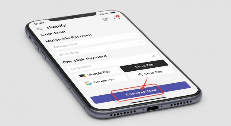
2. Lean into one-click checkout best practices
Modern shoppers expect “Buy Now” to be exactly that — instant. Platforms like Shop Pay, Apple Pay, and Google Pay let people breeze through checkout without typing in their life story.
What you should do:
- Offer all popular one-click options
- Place those buttons above or near the standard pay button
- Clearly label them so customers know they’re safe
If your checkout doesn’t feel like a one-tap experience, you’re losing money.
3. Optimize the flow for thumbs, not mice
Desktop is easy. Big screens, big forms, big clicks. Mobile? Not so much.
Here’s how to make it thumb-friendly:
- Big, easy-to-tap CTA buttons
- Generous spacing between form fields
- Large text for easy reading
- Sticky “Pay” button that stays visible as they scroll
No one should have to pinch-zoom or tap three times to confirm their order.
4. Compare payment solutions
Shopify offers multiple checkout options:
- Shop Pay
- Shopify Payments
- PayPal
- Apple Pay / Google Pay
List them all. Shoppers trust their preferred provider, and familiar logos instantly reassure them. If they see only one payment option, they may bail — even if they like the product.
5. Streamline scripts and third-party bloat
Every extra line of code slows down checkout. Evaluate your apps and integrations:
- Do they really need to fire on checkout pages?
- Are scripts running that don’t help conversion?
If it doesn’t improve trust, speed, or flow, cut it.
6. Use progress indicators
Checkout feels faster if the shopper knows exactly where they are. Add a subtle progress bar or step tracker, even on mobile. It reduces anxiety about how much longer they’ll be stuck filling forms.
7. Test, tweak, test again
Shopify checkout optimization is never one-and-done. Test your checkout on real phones, real people, and real networks. Look for these:
- Laggy button taps
- Jumpy field auto-fills
- Buttons hidden behind pop-ups
One frustrating hiccup on mobile and that conversion is toast.
Building Trust with Shopify Checkout Optimization Payment Signals
Shopify checkout optimization isn’t just about speed or fancy one-click buttons — it’s about trust. Because if customers don’t feel safe handing over their payment info, they’re gone.
Trust is the backbone of any checkout flow, and these payment signals are how you build it.
1. Show familiar payment logos
Think about it: seeing a big, scary “unknown” credit card option is enough to make a buyer second-guess everything. But a checkout page that shows Visa, Mastercard, Apple Pay, PayPal? That’s instant reassurance.
Sprinkle these logos right near your pay button. Familiarity builds confidence, and confidence builds conversions.
2. Use secure SSL and display it clearly
Every Shopify store uses SSL, but most shoppers don’t know what that means. Make it obvious:
- Show a “Secure Checkout” badge
- Add a lock icon near the payment fields
- Include “Encrypted and safe” messaging
People see the lock, their brains relax, and their credit card comes out.
3. Add trust badges strategically
Third-party certifications (Norton, McAfee, etc.) can push conversion rates higher, but only if they’re legit. Place them:
- Near the “Pay Now” button
- Underneath the order total
- Anywhere the shopper might hesitate
Trust badges act like a bouncer outside the club — they let your customers know it’s safe inside.
4. Reinforce your guarantees
Even at checkout, remind them:
- “Free returns within 30 days”
- “No-risk money-back guarantee”
- “Hassle-free exchanges”
A tiny line of text above or below the button can crush last-minute buyer anxiety.
5. Reviews near the checkout
Yep, you read that right. You can — and should — add reviews right at checkout.
- “4.8 stars from 12,000+ customers”
- “Join thousands of happy buyers”
That social proof is the final push for hesitant shoppers.
6. Clean, no-surprise design
This is trust 101:
- Don’t slip in hidden fees
- Show shipping cost before they pay
- Display total prices clearly
Transparency removes the “wait, what?” moment that kills conversions.
7. Match the brand voice to the trust signals
If your site is playful and cheeky, your trust language can be fun — “We triple-dog promise your data is safe.” If you’re premium and elegant, keep it polished. Trust feels strongest when it feels consistent with the rest of your brand.
8. Offer familiar payment options
Beyond the logos, think about these:
- Buy Now, Pay Later (BNPL)
- Shop Pay Installments
- Google Pay / Apple Pay
Modern customers love flexibility. Flexible payment = higher conversions.
9. Test trust signals like everything else
Nothing is sacred in conversion land. Try different positions for trust badges, play with wording, move guarantees higher or lower, and test the results.
Even changing the word “secure” to “encrypted” has moved conversion numbers in some studies.
Adding Upsells During Shopify Checkout Optimization Without Friction
Shopify checkout optimization doesn’t just mean reducing cart abandonment — it’s also your golden opportunity to increase order value without making your customer feel like they’re being held hostage.
The trick? Upsell like a helpful concierge, not a used car dealer. Subtle, relevant, frictionless.
Here’s how to add high-value upsells that boost your AOV without giving shoppers a reason to abandon ship.
1. Pre-checkout upsells (a.k.a. the appetizer)
Before customers reach the final checkout page, offer a gentle nudge:
- “Add a matching case for 50% off”
- “Protect your purchase with a 1-year warranty”
Make it a one-click add. Keep it above the fold. Bonus points if it’s visually consistent with the rest of the product page.
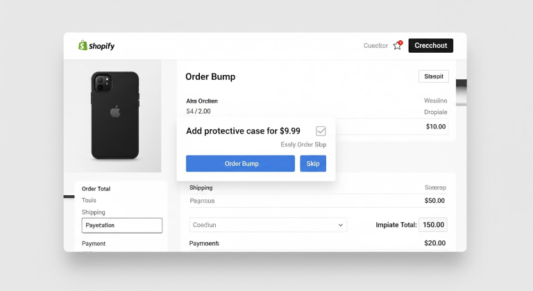
2. Order bumps on the checkout page
These are low-commitment add-ons that show up at checkout — and work best when they’re small, helpful, and relevant:
- “Gift wrap this order for $3.99”
- “Add a travel-size version for just $4 more”
Don’t go overboard. One, maybe two options max. These work because they’re easy to understand and don’t interrupt the flow.
3. Post-purchase upsells (the dessert menu)
The order is placed. The dopamine is flowing. Now’s the perfect time to suggest one more thing:
- “Thanks for your order! Want to add this top-rated item before we ship?”
- “Get free shipping on your next order if you add this now”
Use this moment to build momentum, not slow things down. Shopify apps like ReConvert or AfterSell can automate this beautifully.
4. Offer bundles without being pushy
Bundles are an upsell in disguise — and they work well when:
- The products naturally go together
- The savings are clear (and not suspiciously high)
- The checkout remains clean and clutter-free
Let them build a bundle at checkout and give them a deal that feels like a win.
5. Use urgency sparingly
Yes, urgency drives action. But during checkout, it can easily backfire if it feels aggressive:
- “Only 3 left!” is fine if it’s real
- “Hurry! Add this now or you’ll regret it forever!” … not so much
You want excitement, not panic.
6. Upsell with logic, not desperation
Here’s what works:
- “Customers who bought this also loved ___”
- “This accessory makes your product work even better”
Here’s what doesn’t:
- “Buy this thing too, for reasons we’re not going to explain”
If it doesn’t add obvious value, don’t add it.
7. Make upsells skippable without guilt
If your upsell button is glowing green and the “No thanks” is a faded whisper in light gray, it feels like a trick. And tricks kill trust.
Respect the “no.” Let customers breeze past the offer without hesitation.
8. Use data to personalize offers
Smart upsells feel tailor-made. Use what you know:
- Cart contents
- Browsing behavior
- Purchase history
This isn’t creepy. It’s customer-centric. Just don’t cross the line into “we’re watching you” territory.
9. A/B test everything
Your “add this mini version” upsell might work great for one product… and tank for another. Always test:
- Placement
- Timing
- Wording
- Price
And track your conversion rate after the upsell too — don’t trade AOV for more abandoned carts.
Upsells done right can be a revenue rocket. But in the world of Shopify checkout optimization, the real art is in the subtlety. Guide your customer, don’t hijack them.
Keep it helpful. Keep it relevant. Keep it friction-free.
Tracking & Testing Shopify Checkout Optimization for Conversion Wins
You can’t optimize what you don’t measure — and when it comes to Shopify checkout optimization, guessing is for amateurs. Tracking and testing is where real revenue happens.
This is the part where you put your checkout under a microscope and turn tiny tweaks into massive wins.
1. Start with the right KPIs
Your gut isn’t a strategy. You need data. These are the metrics that matter:
- Abandonment Rate: How many visitors leave without buying? (This one stings.)
- Checkout Completion Rate: The flip side — how many make it through?
- Time on Page: Are shoppers breezing through, or getting stuck?
- Mobile vs. Desktop Conversions: Know where the pain is happening
Set a baseline before you change anything.
2. Use Shopify’s built-in analytics
Yes, Shopify’s native reports are solid. You’ll find checkout behavior reports, device breakdowns, and even payment method performance. Use them.
Not enough? Pair with tools like:
- Google Analytics (GA4) for granular funnels
- Hotjar or Lucky Orange for heatmaps and session replays
These tools show you how shoppers move, click, hesitate, rage-click, and bail.
3. A/B test ruthlessly
Your CTA says “Complete Purchase”? Try “Place My Order.”
No urgency language? Test “Only 2 left in stock.”
No trust badge? Add one.
Test one thing at a time. Keep it clean. And let the test run long enough to be statistically sound (sorry, a weekend doesn’t count).
4. Watch your mobile checkout like a hawk
Mobile users abandon carts like it’s an Olympic sport. So:
- Test how it looks and flows on multiple devices
- Ensure fields don’t jump or auto-scroll weirdly
- Confirm your CTA button is never hidden or too small to tap
The smallest layout glitch can kill conversions.
5. Track upsell performance separately
Did that new order bump increase AOV? Cool.
Did it also increase cart abandonment? Not so cool.
Tag and track upsell offers as separate events. Then you’ll know if your clever add-on is helping or hurting.
6. Monitor payment method usage
Let’s say you added Google Pay and saw a 9% bump in mobile conversions. That’s not luck — it’s leverage.
Shopify lets you break down conversions by payment type. Use that info to:
- Promote popular methods
- Remove the ones nobody touches
- Reorder them based on preference
7. Analyze drop-off points
If most users bail on step 2 of checkout, that’s your clue. Maybe:
- It asks for too much info
- It hides the shipping price
- It throws up unexpected payment hoops
Use Shopify Flow (or GA4 funnels) to see where the flow breaks down.
8. Track returns and refunds, too
Conversion is only half the story. If your checkout pushes people too hard, you’ll see it in your return rates.
Pushy ≠ profitable.
Balance urgency and confidence. You want a buyer who’s sure, not someone who hit “Buy” in a panic.
9. Heatmaps: your secret weapon
Heatmaps show you where shoppers hover, click, and get cold feet.
Use them to:
- Spot confusing sections
- Confirm what people ignore (goodbye, clutter)
- See if your trust signals are even being seen
Sometimes your layout is the villain. Heatmaps help you find the crime scene.
Shopify checkout optimization is part science, part art. But when you commit to testing and tracking like a pro, your conversion rate becomes a controllable outcome — not a mystery.
Remember: every percent counts. Every hesitation matters. And every “Pay Now” is earned, not assumed.

How Cirius Marketing Supercharges Shopify Checkout Optimization
Let’s be honest: most Shopify checkout optimization efforts are a patchwork of “best guesses,” borrowed tactics, and plugin overload. That’s not how you scale a brand. That’s how you build a digital mess.
At Cirius Marketing, we do it differently — methodically, creatively, and data-first.
Here’s how we turn checkout into a conversion machine.
1. Full-funnel checkout audits
We don’t just look at your checkout page and say “Looks good!”
We dig into:
- Funnel friction from product page to payment
- Drop-off diagnostics from desktop and mobile
- Your AOV, cart behavior, and missed upsell opportunities
You’ll get a full report with action steps — not jargon, not guesswork.
2. Frictionless UX design tweaks
Sometimes the devil is in the details. A button too low, a trust badge too hidden, a “Pay Now” that doesn’t pop.
We adjust:
- Layout hierarchy
- Visual flow and field logic
- Mobile and desktop alignment
So shoppers glide through checkout instead of slogging through it.
3. Upsell + trust copywriting that actually works
Most upsells sound like they were written by a bot. Ours? They sound like a smart friend giving helpful advice.
We craft:
- Pre-checkout nudges
- Post-purchase upgrades
- Microcopy that builds confidence, not confusion
It’s persuasive, punchy, and always brand-aligned.
4. Analytics that don’t put you to sleep
We set up tracking that tells you what actually matters:
- Real-time abandonment trends
- High-performing vs. underperforming payment methods
- Conversion flow insights across devices
Then we give you simple, plain-English reports with next steps. Because data only matters if it leads to action.
5. Integrations with the right tools (not all of them)
You don’t need 27 apps. You need the right ones. We help you:
- Implement and configure Shopify checkout apps that fit your flow
- Connect loyalty, UGC, and review systems without creating clutter
- Automate upsells and follow-ups in ways your customers actually enjoy
It’s not about stacking features. It’s about engineering momentum.
6. Constant optimization (because good today isn’t great tomorrow)
The best checkout in the world still needs tuning.
We keep testing:
- New button copy
- Exit pop-ups
- Trust signal placement
- Payment option order
Because the difference between 2.9% and 3.9% conversion? That’s your next growth curve.
If your checkout isn’t optimized, your ad spend is leaking, your customers are hesitating, and your revenue is underachieving. Let’s fix that — with strategy, not guesswork.
Cirius Marketing doesn’t just optimize checkouts. We make them irresistible.