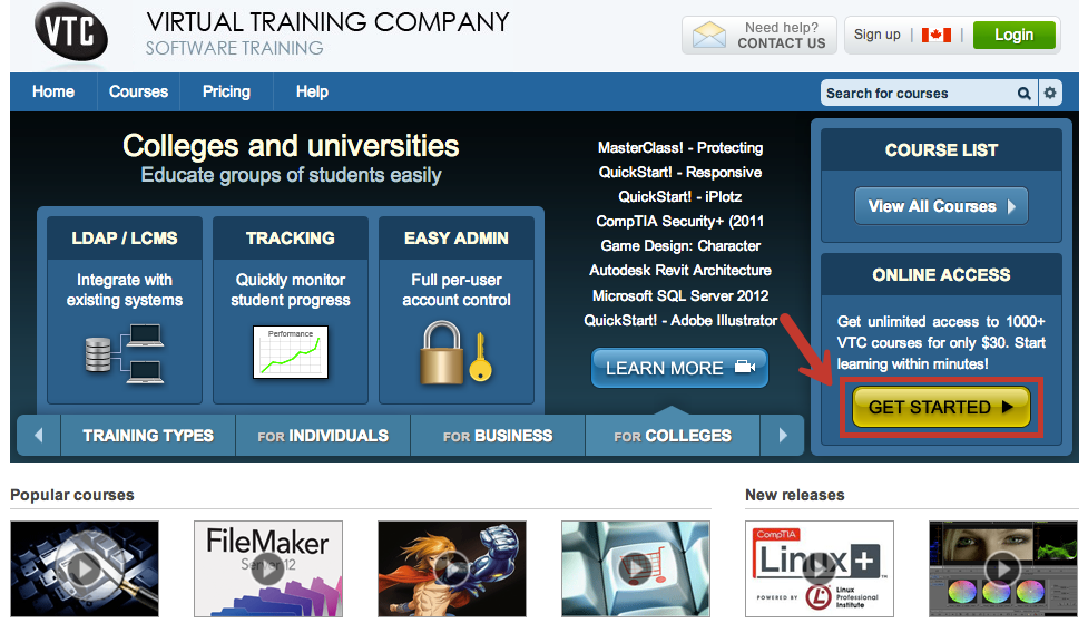
Learn about the dynamics and best practices of a high-converting company homepage.
No matter what industry you’re in, having a high converting company homepage is a necessity.
It lets your visitors know that you’re a trusted authority in your industry.
It also opens up more options for you to sell to your leads and visitors with other forms of content marketing.
In this blog post, we’ll cover the company website homepage best practices you’ll need to keep in mind.
The Design and Content Specifically Resonate With Your Target Market
According to Hubspot’s blog…
“A homepage needs to be narrowly focused — speaking to the right people in their language. The best homepages avoid “corporate gobbledygook,” and eliminate the fluff.”
States Your Value Proposition
As long as your homepage looks good, you have about 5 seconds to give them a reason to stick around.
Smart Bug Media describes what you need in a value proposition very well:
“Your value proposition should answer these questions:
- What is this company/webpage?
- When I’m on this website, what am I able to do?
- Does this website help solve any problems for me?
- Why should I choose this company/website over any others to solve my problems?
Without a value proposition clearly stated, your website visitors can get lost on/bored with your website and never convert.”
You should make it very clear right away what you have to offer, and why they need it.

A Call-to-Action is Above the Fold
All this means is that they don’t have to scroll down to see the action you want them to take.
Email opt-in forms and download buttons should be near the top.
If they don’t see what they should do right away, with a clear description of why they need it and why it’s valuable, there’s a good chance they won’t see it later.
You’ll want to place CTA’s in other places as well!

Simple Navigation Menus are in Clear View
Your navigation menu should be at the top, and it should be as simple as possible.
This is what Optimizely says about keeping it simple:
“Help visitors find what they’re looking for with the least amount of friction. Consider adding a search bar and giving your audience a minimalistic approach. It’s what you put in the navigation that is going to make a difference. Numerous brands will want to put many things in the navigation thinking more options are better. The opposite is correct. The more options, the harder it is for your shopper.”
However, if you have a lot of pages your visitors need to find, creating a sub-menu for each main menu item is the solution.
If your visitors sees a cluttery navigation menu with too many links, this looks messy and overwhelming — definitely not the feeling you want to give your visitors.
Displays Your Latest and Greatest
Put your best stuff front and center.
You want your best services, content or products to be displayed somewhere near the top with a nice big graphic, or graphics if you’re using an image slider.
That about covers it for the company website homepage best practices!
But that’s Just the Homepage…
You website needs more than just a homepage, of course.
If you sell things you need a product page.
You definitely need an “About” page, with your company bio.
If you want your customers to contact you, you need a Contact page!
You can get started with a FREE homepage template, with an option to get templates for the rest of the pages you need for your company website.
