

Let’s cut right to it: if your e-commerce brand style guide lives in a designer’s head or a half-finished Google Doc, it doesn’t exist. And that’s a problem, because inconsistent branding doesn’t just confuse customers, it kills trust. Fast.
An e-commerce brand style guide is your brand’s rulebook. It defines how your brand looks, sounds, and feels, from your Shopify homepage to your email sign-offs. Think of it as the difference between a polished storefront and one with handwritten sale signs taped to the windows. Both technically function… but only one builds loyalty.
This guide isn’t just about aesthetics. It’s about control. Consistency. Recognition. It makes sure that whether your customer finds you on Instagram, unboxes your product, or reads your email footer, they know exactly who they’re dealing with.
It’s more than just where your logo goes
Spoiler: a brand guide that only covers logo placement is a glorified cheat sheet. A true e-commerce brand style guide includes your full identity kit:
- Your logo, in all its glory and variations
- Your color palette, down to the HEX
- Your go-to fonts and how not to use them
- The tone of voice that speaks to your people
- The type of visuals you use (and just as importantly, don’t)
It’s not a suggestion, it’s a system. And systems scale. Whether you’re a solo founder or have a growing creative team, a brand guide keeps everyone on the same page and your brand from accidentally shapeshifting across platforms.
Consistency builds trust, and makes sales easier
Imagine a customer sees your Instagram ad. It’s playful, bold, and full of personality. They click through to your Shopify site… and land on a page that looks like it was built in a rush at 2 a.m. using a completely different font, color scheme, and tone. That disconnect? It feels sketchy, even if your product is amazing.
Your e-commerce brand style guide prevents that brand whiplash.
By setting visual and tonal standards upfront, you avoid the “wait… is this the same brand?” reaction that makes potential buyers hesitate. And in e-commerce, hesitation is the enemy.
A good brand guide speeds up your team (and makes freelancers better)
Hiring a new designer? Bringing in a freelance copywriter? Launching your first paid ads?
Instead of starting from scratch, you hand them your style guide. It’s the playbook they didn’t know they needed. It tells them what your brand sounds like, what it looks like, and what absolutely not to do. That means faster timelines, fewer revision loops, and output that actually feels on-brand, even if it’s their first week working with you.
It’s the foundation of every branded asset you create
From Shopify product pages to TikTok captions, your style guide influences it all. A well-crafted e-commerce brand style guide keeps your:
- Emails feeling like conversations, not campaigns
- Ads looking native to your brand, not slapped together in Canva
- Product pages cohesive, even when your lineup expands
- Customer service messages on-brand, not robotic
Basically, it’s the cheat code for brand cohesion without having to micromanage every creative decision.
How do you know if you need one?
If you’ve ever:
- Sent a creative brief with the words “just use the last ad as inspiration”
- Seen three different fonts used on the same Instagram grid
- Had a designer ask you what color blue you meant
- Or cringed at a headline that sounded nothing like your brand…
…you need one. Actually, you probably needed one yesterday.
Your brand deserves more than vibes
Here’s the bottom line: Your brand should never feel like a mood. It should feel like a message. One that’s repeatable, scalable, and unmistakably yours.
And if you want your customers to remember you, recognize you, and refer you? That message better look and sound the same every time they meet it.
Core Components of a Successful E-commerce Brand Style Guide
An e-commerce brand style guide isn’t just a pretty PDF to impress investors or designers. It’s a command center. It’s the branding equivalent of GPS, you hand it to anyone on your team and they know exactly how to get from “concept” to “on-brand masterpiece” without taking weird detours through genericville.
If your guide only covers logo variations and a couple of font names, you’re missing 90% of what makes a brand recognizable. Here’s what a real e-commerce brand style guide should include, and why every pixel, paragraph, and packaging slip should follow it.
Your logo: all versions, all rules, no guesswork
Start with your logo, yes, but not just the one. Your brand guide should include:
- Primary and secondary logos
- Monogram or icon version
- Where and when to use each
- Minimum size, padding, and don’t-you-dare-do-this examples
This means no more seeing your logo stretched like pizza dough or slapped on backgrounds it was never meant to meet. You’re protecting brand equity here, not just design preferences.
Your color palette: consistency in every channel
Color does more than “look good.” It triggers recognition. Ever see that certain red and instantly think Coca-Cola? That’s no accident.
Your e-commerce brand style guide needs:
- HEX codes for web
- CMYK for print
- RGB for screens
- Clear hierarchy (primary vs. accent colors)
- What backgrounds or overlays work, and which don’t
This isn’t just for your designers. It’s for the person updating your Shopify theme, your social media intern, even the freelance ad guy you just hired off Upwork.
Typography: the unsung hero of visual branding
Your fonts matter. A lot. They communicate tone before a word is even read.
List your:
- Primary typeface for headlines
- Secondary for body text
- Sizes, weights, and spacing
- Do’s and don’ts for pairing (because Arial and Lobster should never date)
Keep it simple. Two fonts max. And no weird “inspired by Comic Sans” energy. Your typography should reflect your personality, whether that’s modern and minimalist or bold and playful.
Image guidelines: how your brand looks beyond the logo
Stock photos are fine, if they look like they belong to your brand. That’s a big if.
Your e-commerce brand style guide should explain:
- Product shot requirements (angle, lighting, background)
- Lifestyle images (who’s in them, how they feel)
- Editing style: warm tones, neutral filters, etc.
- No-go zones: clichés, overused stock, off-brand aesthetics
Why does this matter? Because the difference between a consistent brand and a scattered one is often a handful of mismatched images on your homepage.
Voice, tone, and messaging: what your brand sounds like
This is where your brand gets its soul.
Your guide should break down:
- Brand personality traits (are you friendly? authoritative? cheeky?)
- Writing tone: formal vs. conversational
- Sample copy: email intros, CTA buttons, product blurbs
- Phrases to use and avoid
- How your tone shifts across platforms (your website vs. TikTok captions)
This part is gold for content teams, customer support, and anyone writing as “you.” If your tone feels off in even one customer interaction, the whole experience starts to wobble.
Shopify-specific branding guidelines: where identity meets UX
Yes, Shopify matters. Your site is the core of your brand experience, so your e-commerce brand style guide should include how your identity gets applied to:
- Homepage design (banner structure, color overlays, type treatment)
- Product page layout (CTA button styling, fonts, review placement)
- Navigation tone (“Explore” vs. “Shop Now”)
- Announcement bars, pop-ups, and footer styling
Every template, every theme, every banner, aligned and unmistakably “you.”
The hidden bonus: brand discipline at scale
A complete brand style guide doesn’t just make things easier, it makes them repeatable. You can delegate confidently, launch new SKUs without identity drift, and onboard creatives in half the time.
And here’s the kicker: even if you’re not a “big brand,” having this level of detail makes you feel like one. And customers notice that.

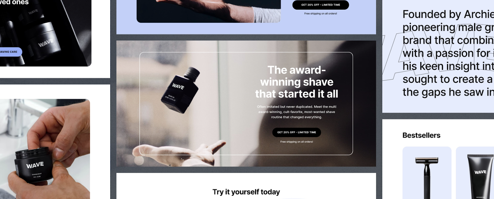
Shopify Brand Identity in Action: Real Examples from Leading Stores
Talk is cheap. Branding is not. And if you want proof that a solid e-commerce brand style guide actually works, just look at the Shopify giants who’ve mastered it. The brands everyone instantly recognizes didn’t get there by chance, they got there by design. Literal design.
The secret behind every “wow, their brand is everywhere” moment? A style guide so tight, even their email footers feel on-brand.
Let’s break down how top Shopify stores turn consistent branding into cult followings, and what you can steal from them without needing their ad budgets.
Allbirds: minimalism meets memorability
You could recognize Allbirds’ branding blindfolded. Neutral tones. Rounded fonts. Sustainable everything. From their product pages to their packaging, they’ve nailed a visual language that whispers “eco” and “effortless” in the same breath.
What they do right:
- Color restraint: They let materials and tone do the talking. Nothing fights for attention.
- Typography: Sans-serif fonts that feel clean, calm, and intelligent.
- Voice: Friendly and smart without trying too hard. Reads like a friend who composts and actually makes it look cool.
- Image style: Clean, soft lighting. Natural backdrops. No over-editing.
Their e-commerce brand style guide clearly instructs every asset, from their “why wool?” explainer pages to their welcome email sequence. It’s not just cohesive. It’s unmistakable.
Gymshark: bold, driven, hyper-consistent
Everything Gymshark touches looks like it belongs in the same family. Their product photography? Gritty but clean. Their fonts? Thick, modern, powerful. Their tone? Motivational with a wink of swagger.
Why it works:
- Visual identity: Black and white with intentional color pops. Never off-brand.
- Tone of voice: They hype you up. You feel it in their ad copy, social captions, even their support chatbot.
- Social media: You know it’s Gymshark without seeing the handle. That’s branding.
Their emails, website, and Instagram grid all follow the same playbook, and that playbook is their e-commerce brand style guide.
Blume: playful but polished
Blume is a Shopify darling that proves personality doesn’t have to mean chaos. Their brand identity is bright, fun, and ultra-youthful, but still organized.
Here’s how they keep it tight:
- Fonts: Soft, rounded, and non-corporate.
- Colors: Pastels with intention. Pink isn’t a trend here, it’s a strategy.
- Imagery: Diverse, relatable, and clearly built for social.
- Messaging: Quirky without losing clarity. They don’t just sell products, they sell empowerment.
And it all works because their style guide doesn’t leave room for interpretation. Their brand tone and visuals are locked in across their Shopify site, marketing assets, and even packaging slips.
What you can take from the greats
You don’t need to be a billion-dollar brand to build brand recognition, you just need consistency. Every brand mentioned above uses a detailed e-commerce brand style guide to make sure their:
- Emails don’t feel like they were written by three different people
- Ad creatives don’t look like Frankenstein’s mood board
- Product pages don’t feel like they were outsourced to ten different designers
Here’s what they all have in common:
- A documented visual identity that covers logo, fonts, colors, and layout
- A clear voice guide that translates across email, ads, support, and packaging
- Unified design across all platforms, Shopify, Meta, TikTok, email, the whole thing
Why it matters more for growing brands
When you’re a one-person show, consistency is easy. But as you scale, hire freelancers, outsource ads, grow your SKU count, you need something that makes your brand idiot-proof. That’s what these top brands figured out early. Their success isn’t just about traffic or product, it’s about recognition.
And recognition starts with repetition. Clean, strategic, beautifully on-brand repetition.
https://instant.so/blog/best-shopify-themes
Applying Your E-commerce Brand Style Guide Across All Channels
So you’ve got a shiny new e-commerce brand style guide. It’s filled with beautiful fonts, dialed-in colors, voice notes that actually sound like you, and just the right amount of sass in your CTA button copy.
Now what?
Well, now it’s time to use it. Everywhere.
Because the real power of a style guide isn’t in the PDF, it’s in the execution. And if your homepage looks one way, your emails look another, and your Instagram grid looks like it’s been curated by three different interns on three different continents… congrats, you’ve got a brand confusion problem.
Let’s fix that.
Shopify site: where brand identity starts (and gets judged in 5 seconds)
Your site is your storefront. If your e-commerce brand style guide isn’t reflected here, what are we even doing?
Here’s where to apply it:
- Homepage banners: Use brand photography and copy that sound like your About page actually matters.
- Product pages: Headlines, font hierarchy, color overlays, make it match your guide.
- CTAs: “Add to Cart” doesn’t have to be boring. Try “Get My Bundle,” “Snag It Now,” or anything on-brand.
- Navigation & footers: Subtle, but these should follow your color, tone, and spacing rules too.
The more consistently your brand shows up, the less doubt your customer has. And in Shopify-land, doubt is a conversion killer.
Email marketing: your brand’s voice, scaled
Emails are often your most direct line to your customers. Don’t blow it by sounding like a different brand every time you send something.
Your e-commerce brand style guide should inform:
- Subject lines: Does your brand sound cheeky, bold, classic? Stick with it.
- Header/footer designs: Keep colors and spacing aligned with your site.
- Button styles: Your CTA in emails should look like the one on your product page.
- Copy tone: Don’t go from “Hey bestie” on Instagram to “Dear Valued Customer” in email. Pick a lane.
Email is branding in motion. Every message reinforces, or weakens, how you’re remembered.
Social media: your scroll-stopping showroom
Social is where your brand style either shines or completely falls apart. One Canva template too far off the guide and suddenly your posts look like they were made in 2009 on a borrowed laptop.
Keep your:
- Colors consistent (use your palette for overlays, text, background)
- Fonts uniform (no mix-and-match typography roulette)
- Voice tight (captions, hashtags, story tone, same energy as everywhere else)
- Templates templated (have branded layouts for product drops, quotes, announcements)
A consistent visual grid makes your brand instantly recognizable, even without a logo screaming in every post.
Ad creatives: where brand and performance meet
Ads don’t have to look like ads. In fact, they shouldn’t, not if you want people to stop and look.
So why are so many ad creatives off-brand?
Your e-commerce brand style guide should be the starting point for every paid campaign:
- Design: Keep colors, layouts, and tone on-brand, don’t reinvent your aesthetic for Meta.
- Copy: The voice should be yours, even if you’re in promo mode.
- Product visuals: Use your same filters, backgrounds, and styling techniques
- Consistency between organic and paid: If someone clicks your IG ad and lands on a Shopify page that looks totally different… awkward.
Ads are the front door for thousands of potential customers. Make sure that door looks like the rest of your house.
Quick alignment checklist for your channels
Here’s your lightning-round guide to applying your brand style across the board:
- ✅ Homepage: Fonts, banners, tone = on-brand
- ✅ Emails: Headers, buttons, copy = consistent
- ✅ Social: Visuals, voice, grid = instantly recognizable
- ✅ Ads: Design and tone = performance-ready without going off-script
When in doubt? Open your brand style guide. If something feels “off,” it probably is.

How Cirius Helps You Create and Launch an E-commerce Brand Style Guide
Look, we love a well-designed brand guide as much as the next Shopify nerd. But here’s the real flex: building one that doesn’t just sit in a Dropbox folder collecting digital dust. A real e-commerce brand style guide isn’t just pretty, it works. Daily. Across every click, scroll, and unboxing.
That’s where Cirius comes in. We don’t hand you a templated brand doc and call it strategy. We build your guide from the inside out, make it actually reflect who you are, and then show you exactly how to apply it like a pro.
Step 1: We dig into your brand DNA before touching fonts or colors
You can’t build a consistent brand if no one knows what you stand for. So we start with a discovery session, like brand therapy, but with better outcomes.
We ask things like:
- Who are you really talking to?
- What do you want people to feel after interacting with your brand?
- What does your brand never do, even on its worst day?
This becomes the voice and personality that guides every word, every ad, and every page on your Shopify site.
Step 2: We create a visual identity that looks as sharp as it sounds
This is where your e-commerce brand style guide starts to take visual form. We develop:
- A logo system that works in every format (from your product label to a TikTok profile pic)
- A color palette that looks good everywhere, not just on your desktop monitor
- A font pair that vibes with your brand and won’t age like last year’s meme
- Image guidelines that are “scroll-stopping,” not “stock-photo bland”
The goal? Total recognition at a glance, whether it’s a Facebook ad or a Shopify banner.
Step 3: We build your full brand style guide (PDF, editable templates, everything)
This isn’t a single page of vague design tips. You get a fully developed e-commerce brand style guide, which includes:
- Logo usage and spacing rules
- Brand color specs (HEX, RGB, CMYK)
- Font pairings and type hierarchy
- Voice and tone breakdowns with copy examples
- Do’s and don’ts for visual content
- Examples for Shopify layout use, ad creatives, email formatting, and more
Plus, we give you versions you can actually use, like editable Canva templates, web-ready swatches, and plug-and-play headers for email or paid ads.
Because your guide should work with your team, not intimidate it.
Try These Brand Style Prompts
Before you lock in your final style guide, here are 3 quick prompts you can run through ChatGPT (or any AI assistant) to see if your brand identity is actually doing what you want it to do.
Just copy, paste, and fill in the blanks:
Prompt 1: Logo Snapshot
Upload your logo and ask:
“Can you give me a quick overview of my logo’s look and feel, font, color impression, and general design style?”
Prompt 2: Brand Match Check
“Here’s my logo and brand name: [insert name]. Does this feel like a match for the kind of vibe I want my brand to give off?”Prompt 3: Verbal Style Starter
“My brand is called [insert name]. We sell [product/service] to [describe your target customer]. I want the brand to feel [e.g., approachable, bold, premium, fun]. What tone of voice and language style would best help us connect with this audience? Be critical.”Step 4: We align your Shopify theme with your new brand identity
No point having a guide if your site still looks like it’s from your pre-rebrand era.
We help you:
- Update Shopify homepage banners
- Tweak product pages for consistency
- Style your CTA buttons and fonts
- Clean up your footer and nav structure
- Align mobile and desktop experiences with your identity
It’s your style guide, applied everywhere, so customers stop guessing and start recognizing.
Step 5: We train your team to keep everything on-brand (without losing speed)
Because let’s be honest, none of this matters if your team can’t use it. So we don’t just hand it over and say “good luck.” We walk your team through how to:
- Create branded content without asking for approval every 5 minutes
- Make decisions that align with your voice and visuals
- Use your style guide as a blueprint for everything from email to UGC
Need to onboard a new designer, copywriter, or virtual assistant? Your guide becomes their cheat sheet. Less guesswork. Faster results. Fewer branding hiccups.
Step 6: We help you scale your brand without losing your identity
The bigger your brand gets, the harder it is to keep everything tight. But your e-commerce brand style guide can scale with you, if it’s built right.
We help you:
- Add new products or categories without splintering your aesthetic
- Expand into new channels while keeping your tone consistent
- Update your guide every quarter as your brand evolves
It’s not about staying stuck. It’s about growing on-brand.
Real talk: this is what separates brands that last from brands that lag
The Shopify world is full of “cool-looking” brands that burn out fast because they don’t know who they are, or how to show it. Your style guide is how you stay recognizable, scalable, and impossible to ignore.
And Cirius? We make sure it’s not just beautiful, but bulletproof.

Want your brand to look as consistent as it performs?
Book a Free Identity Strategy Session with Cirius Marketing.