Why High-Converting Landing Pages Are the Secret to More Sales
If you think your Shopify store can survive without high-converting landing pages, I have some bad news—you’re losing sales faster than a toddler with a melting ice cream cone.
A high-converting landing page is the difference between a visitor bouncing and a visitor buying. It’s where curiosity turns into action, and where window shoppers become paying customers.
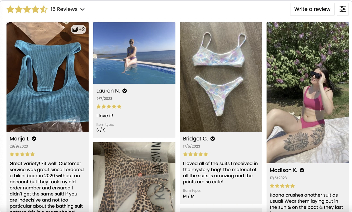
SOURCE: https://gempages.net/blogs/shopify/shopify-landing-page-examples
Yet, most e-commerce brands get it wrong:
❌ They clutter their page with distractions. (Looking at you, random pop-ups.)
❌ Their CTA button blends in like camouflage. (“Submit” is not a strong CTA, folks.)
❌ Their page loads slower than dial-up internet in 1999.
But don’t worry—you’re about to learn exactly what makes a landing page convert like crazy.
What You’ll Learn in This Guide
By the time you finish reading this, you’ll know how to:
✅ Build a landing page that turns visitors into buyers.
✅ Craft headlines that hook attention in three seconds or less.
✅ Design pages that load fast and look amazing on mobile.
✅ Write persuasive copy that makes people say, “Take my money!”
✅ Create call-to-action buttons that people actually want to click.
Most importantly, you’ll learn how Cirius Marketing can help you build landing pages that don’t just look good—they actually convert.
High-Converting Landing Pages: Your Secret Weapon for More Sales
Your Shopify store’s homepage is NOT a landing page—and if you’ve been treating it like one, you’re leaving money on the table.
A high-converting landing page is built with one goal in mind: to turn visitors into buyers. Unlike a homepage—where distractions are everywhere (menus, social links, blog posts, your pet goldfish’s Instagram feed)—a landing page keeps visitors laser-focused on taking action.
💡 Think of it this way: Your homepage is like a shopping mall—tons of stores, lots of distractions. But a landing page? It’s like an Apple Store—clean, sleek, and designed to guide customers straight to checkout.
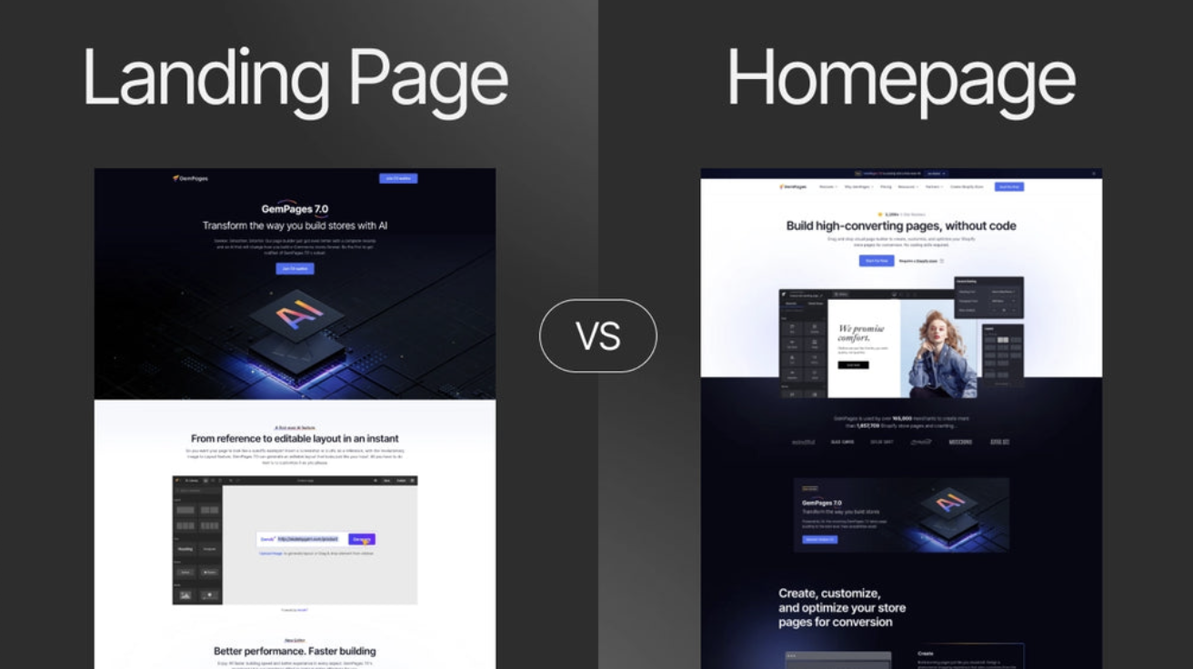
SOURCE: https://gempages.net/blogs/shopify/landing-page-vs-home-page
Landing Pages vs. Homepages: Why Focus Matters
📌 Homepages:
- ❌ Too many distractions—menus, navigation bars, random links.
- ❌ No clear CTA—visitors don’t know what to do next.
- ❌ Not optimized for conversions—it’s designed for browsing, not buying.
📌 High-Converting Landing Pages:
- ✅ Laser-focused on one goal—no distractions.
- ✅ One clear CTA—shop now, sign up, or claim an offer.
- ✅ Designed for conversions—copy, design, and layout all lead to action.
✅ Example: A Shopify brand selling skincare products switched from using their homepage to a dedicated landing page for a new product launch. The result? Conversion rates jumped from 1.2% to 4.8%.
Why Every Shopify Store Needs Dedicated Landing Pages
1️⃣ They increase conversions – No distractions = more sales.
2️⃣ They’re optimized for lead generation – Perfect for collecting emails.
3️⃣ They work better for paid ads – Your ads should link to a landing page, NOT your homepage.
4️⃣ They help track ROI – Easier to measure conversions and tweak campaigns.
💡 Pro Tip: Every marketing campaign—whether it’s a Facebook ad, influencer collab, or email blast—should have its own landing page.
What Every High-Converting Landing Page Must Have
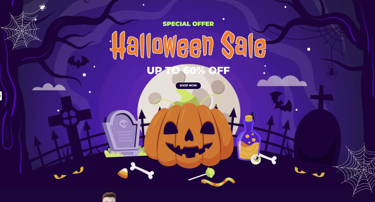
SOURCE: https://ecomposer.io/blogs/news/shopify-landing-page-examples
Not all landing pages are created equal. Some turn visitors into customers faster than a free sample table at Costco, while others have the conversion rate of a soggy napkin.
So what makes the difference? A high-converting landing page follows a winning formula. If your landing page is missing any of these elements, you’re basically asking visitors to leave without buying.
1. A Compelling Headline That Hooks Visitors in 3 Seconds
💡 Fact: The average visitor spends less than 8 seconds deciding whether to stay on your page. If your headline doesn’t grab them instantly, they’re gone.
✅ Good Example: “Achieve Clear Skin in 7 Days – No Harsh Chemicals Required”
❌ Bad Example: “Welcome to Our Skincare Store” (Yawn… and they’re gone.)
📌 Headline Formula for High-Converting Landing Pages:
- Call out the problem: “Tired of slow-loading Shopify pages?”
- Offer a clear benefit: “Boost Sales by 3X with Faster Checkout.”
- Use numbers & timeframes: “Lose 10 lbs in 30 Days – Without Giving Up Your Favorite Foods.”
✅ Example: A Shopify fitness brand A/B tested two headlines. The one with a specific benefit (“Burn Fat in 30 Days Without the Gym”) had a 68% higher conversion rate than the generic alternative.
2. Strong Visuals & Product Imagery – First Impressions Matter
👀 People process visuals 60,000x faster than text. If your landing page has low-quality images or cluttered design, you’re already losing customers.
📌 Best Practices for Landing Page Visuals:
✅ Use high-quality product images or lifestyle shots.
✅ Include short videos or GIFs showing the product in action.
✅ Make sure visuals support the CTA (not just “look pretty”).
✅ Example: A Shopify apparel brand replaced generic stock photos with real customer images and saw a 33% increase in add-to-cart conversions.
3. A Clear, Action-Driven CTA (Call-to-Action)
Your CTA is THE most important part of your landing page. If it’s weak, vague, or hidden, your conversions will tank.
📌 What a High-Converting CTA Needs:
✅ Bold, clear text (No “Submit” or “Learn More” buttons!)
✅ Contrasting color (It should pop from the page.)
✅ A strong action verb (Buy, Get, Claim, Download, Start, etc.)
✅ Good CTA Examples:
- “Get 10% Off – Claim Your Discount Now”
- “Start Your Free 30-Day Trial”
- “Shop Now – Limited Stock Available”
❌ Bad CTA Examples:
- “Click Here” (Click where? Why?)
- “Submit” (Submit to what? A cult?)
✅ Example: A Shopify beauty brand tested “Add to Cart” vs. “Get My Glow-Up Kit” as a CTA. The more personalized CTA increased conversions by 27%.
4. Trust Signals & Social Proof – Show Why They Can Trust You
If a visitor doesn’t trust your brand, they won’t buy.
📌 How to Build Instant Credibility:
✅ Customer Reviews & Testimonials – People trust other buyers over brands.
✅ Trust Badges (Money-Back Guarantee, Secure Checkout, etc.) – Reassures customers.
✅ Logos of Media Features or Certifications – Adds authority.
✅ Example: A Shopify wellness brand added 5-star customer reviews near the CTA button and saw a 19% increase in conversions.
5. A Clean, Distraction-Free Layout
🚫 No sidebars. No pop-ups. No unnecessary links.
📌 How to Keep Your Landing Page Focused:
✅ One goal per page – No extra links to “About Us” or social media.
✅ Simple, mobile-friendly design – 60%+ of traffic comes from mobile.
✅ Fast loading speed – Every extra second in load time drops conversions by 7%.
✅ Example: A Shopify electronics brand removed cluttered navigation links and reduced their page load time from 4.3s to 1.8s. Their conversion rate jumped by 32%.
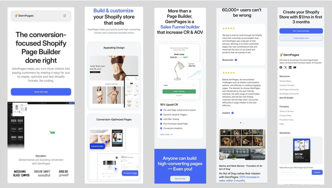
SOURCE: https://gempages.net/blogs/shopify/mobile-landing-pages
Now that you know how to design a Shopify landing page for high conversions, let’s talk about how to write persuasive landing page copy that actually sells.
Landing Page Copywriting Strategies That Turn Clicks Into Sales
A beautifully designed landing page without great copy is like a sports car with no engine—looks good, but it won’t get you anywhere.
If you want a high-converting landing page, your copy needs to grab attention, build trust, and get visitors to take action—all before they have time to second-guess themselves.
Here’s how to write landing page copy that actually converts.
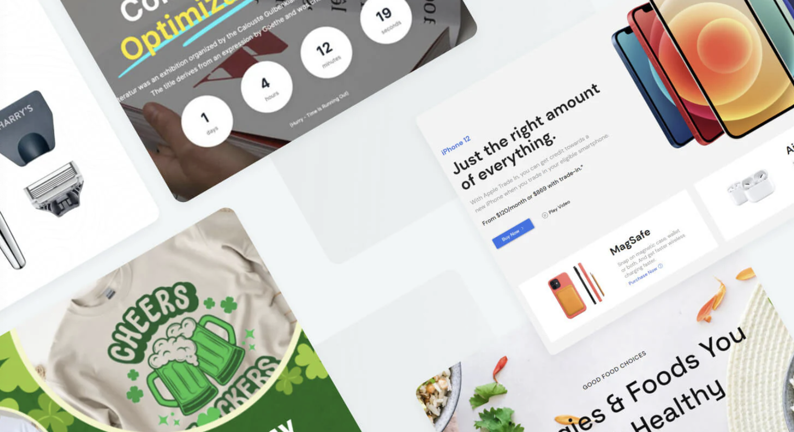
SOURCE: https://ecomposer.io/blogs/news/shopify-landing-page-examples
1. Headline Formulas That Hook Visitors in Seconds
💡 Fact: 80% of visitors will read your headline, but only 20% will read the rest.
Your headline needs to instantly tell visitors why they should care.
📌 Winning Headline Formulas:
✅ “How to [Achieve Desired Result] Without [Biggest Pain Point]”
- “How to Get a Perfect Night’s Sleep Without Expensive Mattresses”
✅ “The Secret to [Goal] That [Unexpected Benefit]” - “The Secret to Faster Weight Loss That Doesn’t Involve the Gym”
✅ “X Ways to [Solve Problem] in [Short Timeframe]” - “3 Simple Ways to Increase Shopify Conversions in 7 Days”
✅ Example: A Shopify gadget store changed their headline from “Smart Home Tech for Everyone” to “Upgrade Your Home in 5 Minutes – No Tools Required” and saw a 42% increase in conversions.
2. Benefit-Driven vs. Feature-Driven Copy – Sell the Outcome
Nobody buys features—they buy what those features do for them.
📌 Feature vs. Benefit Copy Examples:
❌ Feature: “Our running shoes have memory foam insoles.”
✅ Benefit: “Feel like you’re running on clouds with our ultra-soft memory foam.”
❌ Feature: “This skincare serum has 2% hyaluronic acid.”
✅ Benefit: “Get glowing, hydrated skin in just 7 days with dermatologist-approved ingredients.”
✅ Example: A Shopify beauty brand swapped feature-heavy product descriptions for benefit-driven copy and increased checkout rates by 31%.
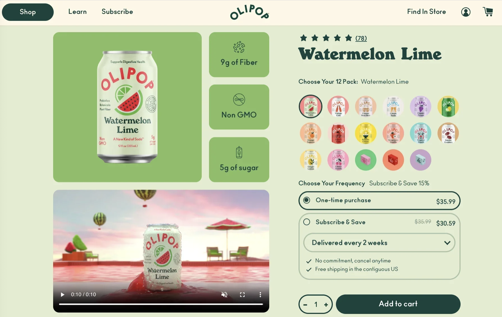
SOURCE: https://ecomposer.io/blogs/news/shopify-landing-page-examples
3. How to Use Power Words & Urgency to Increase Conversions
Certain words trigger emotions and push people toward action.
📌 Power Words That Boost Conversions:
✅ Urgency & Scarcity: Limited-Time, Last Chance, Don’t Miss Out, Hurry
✅ Trust & Security: Guaranteed, Proven, Backed by Science, Risk-Free
✅ Exclusivity: VIP, Members-Only, Special Offer, Insider Access
✅ Example: A Shopify electronics store changed their CTA from “Shop Now” to “Claim Your Exclusive Deal – 24 Hours Only” and saw a 19% lift in click-through rate.
4. Storytelling Elements That Build an Emotional Connection
People remember stories, not sales pitches.
📌 How to Add Storytelling to Landing Pages:
✅ Show real customer journeys – “I struggled with acne for years until I found…”
✅ Create relatable scenarios – “Tired of tossing and turning all night?”
✅ Use social proof as part of the story – “See why 10,000+ Shopify store owners trust this tool.”
✅ Example: A Shopify home decor brand added customer testimonials written as short stories and increased conversions by 22%.
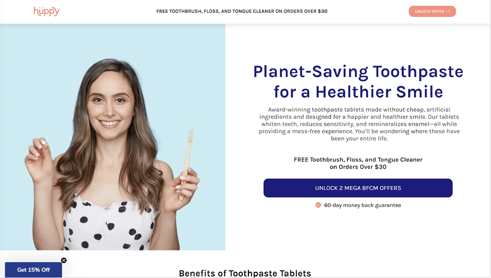
SOURCE: https://ecomposer.io/blogs/news/shopify-landing-page-examples
Your Lead Capture Form Could Be Costing You Sales
Imagine this—you finally get a visitor to your high-converting landing page, they love what they see, and they’re about to sign up… but then they see your opt-in form, sigh, and leave.
Why? Because your form is asking for too much, too soon.
🚫 Nobody wants to fill out a form that looks like they’re applying for a mortgage.
A high-converting lead capture form is short, simple, and designed to get users to say “YES” without hesitation.Here’s how to get more sign-ups without scaring people away.
1. How Many Form Fields Should You Use? (Less is More)
💡 Fact: Reducing form fields from 6 to 3 can increase conversions by 25% or more.
📌 The Sweet Spot for Lead Capture Forms:
✅ Email Only (Best for Simple Opt-Ins) – Ideal for newsletters, discounts, and free guides.
✅ Name + Email (Best for Personalization) – Works well for exclusive content and VIP access.
✅ Name + Email + One Custom Field (Best for Segmentation) – Good for product recommendations or lead scoring.
🚫 Avoid forms that ask for unnecessary details like phone numbers, job titles, or “How did you hear about us?” (unless it’s absolutely necessary).
✅ Example: A Shopify beauty brand reduced their form from 5 fields to just Name & Email and saw a 32% increase in opt-ins.
2. The Importance of A/B Testing Lead Capture Forms
📌 What You Should Test:
✅ Short vs. long forms – Does asking for a first name help or hurt conversions?
✅ CTA button wording – “Sign Up” vs. “Get My Free Guide”
✅ Form placement – Pop-up vs. inline form
✅ Example: A Shopify supplement store tested “Sign Up” vs. “Get My 10% Discount” as their form CTA. The second version converted 18% higher.
3. How to Increase Opt-Ins with Irresistible Lead Magnets
🚀 Nobody gives away their email for free. If you want people to sign up, you need to offer something valuable.
📌 Top Performing Lead Magnets for E-commerce Lead Generation Pages:
✅ Discount Codes – “Get 10% Off Your First Order”
✅ Exclusive Guides or Tutorials – “Learn How to Boost Shopify Sales in 7 Days”
✅ Free Samples or Trials – “Claim Your Free Skincare Sample”
✅ Giveaways & Contests – “Enter to Win a $100 Gift Card”✅ Example: A Shopify pet brand offered a “Free Pet Nutrition Guide” instead of just asking for an email. Their opt-in rate jumped by 41%.
Why Your Landing Page Isn’t Converting (And How to Fix It)
You’ve set up your high-converting landing pages, optimized your CTA, and crafted compelling copy. But if your conversion rate still looks like a sad, deflated balloon, chances are you’re making one (or more) of these common mistakes.
Let’s dive into what’s killing your conversions and how to fix it.
1. Cluttered Design & Too Many Distractions
🚫 If your landing page looks like a chaotic flea market, visitors will leave.
📌 Why It Kills Conversions:
- Too many links = decision paralysis (visitors don’t know where to click).
- Overloading text = visual fatigue (people won’t read walls of text).
- Auto-play videos, pop-ups, and moving elements = distraction overload.
📌 How to Fix It:
✅ Keep it clean and minimal – Focus on one goal per page.
✅ Use white space strategically – Let key elements breathe.
✅ Remove extra navigation links – A landing page should not have a full menu bar.
✅ Example: A Shopify electronics store removed unnecessary menu links and increased conversions by 21%.
2. Weak or Generic CTA Buttons
🚫 “Submit” is not a CTA. It’s a sad, lifeless button.
📌 Why It Kills Conversions:
- Visitors don’t know what happens after they click.
- Generic CTAs don’t create urgency or excitement.
- A weak CTA blends into the page instead of standing out.
📌 How to Fix It:
✅ Make your CTA bold and specific – “Get My Discount” works better than “Submit.”
✅ Use urgency words – “Claim Your Free Gift – Offer Ends Soon.”
✅ Ensure strong contrast – The CTA button should visually pop from the page.
✅ Example: A Shopify beauty brand changed “Learn More” to “Get My Glow-Up Kit” and saw a 19% boost in click-through rates.
3. Lack of Social Proof & Trust Signals
🚫 If visitors don’t trust you, they won’t buy from you.
📌 Why It Kills Conversions:
- No reviews? People assume your product is untested.
- No guarantees? Shoppers fear losing money.
- No trust badges? Customers question payment security.
📌 How to Fix It:
✅ Add customer testimonials – Bonus points for video testimonials.
✅ Include star ratings and reviews – Even better if they’re near the CTA.
✅ Display money-back guarantees and trust badges – Reassures skeptical buyers.
✅ Example: A Shopify wellness brand added a “100% Money-Back Guarantee” badge below their CTA and increased conversions by 15%.
4. Ignoring Mobile-Friendliness & Slow Load Times
🚫 If your landing page doesn’t load in under 3 seconds, visitors leave.
📌 Why It Kills Conversions:
- Mobile shoppers make up 60%+ of Shopify traffic – If your page isn’t optimized, you lose sales.
- Slow load times increase bounce rates by 32% after just 3 seconds.
📌 How to Fix It:
✅ Compress images – No one needs a 5MB hero image.
✅ Use lazy loading – Only load images as they appear on screen.
✅ Test mobile responsiveness – Ensure your CTA is easy to tap.
✅ Example: A Shopify apparel store reduced load time from 4.2s to 1.9s and saw a 27% drop in bounce rate.

Why DIY Landing Pages Might Be Costing You Sales
Building high-converting landing pages isn’t just about slapping together a few images and a CTA button.
🚫 A slow, cluttered, or poorly designed landing page will kill your conversion rate faster than a sketchy checkout page.
If you want a landing page that actually drives sales, it needs to be:
✅ Strategically designed – Every element should guide the visitor toward action.
✅ Persuasively written – Copy that speaks to your audience and eliminates objections.
✅ Tested & optimized – Continuous A/B testing to improve conversions.
💡 That’s exactly what Cirius Marketing does. We build custom Shopify landing pages that don’t just look pretty—they convert visitors into paying customers.
1. Custom Shopify Landing Page Design for Maximum Conversions
Most Shopify store owners aren’t designers, and most designers aren’t marketers—which is why you need a landing page built by experts who know both.
📌 How We Design High-Converting Shopify Landing Pages:
✅ Fast-loading, mobile-optimized designs – No lag, no frustration, no lost sales.
✅ Strategic CTA placement – Every CTA is designed to maximize clicks.
✅ Distraction-free layouts – Focused on one goal: getting the visitor to take action.
✅ Example: A Shopify wellness brand switched from a self-made landing page to a custom-designed Cirius Marketing page and saw a 46% increase in conversions.
2. Expert Copywriting & CTA Optimization for Maximum Sales
🚫 Boring, vague copy doesn’t sell.
Your landing page needs copy that stops the scroll and convinces visitors to buy.
📌 How Our Copywriting Converts Better:
✅ Attention-grabbing headlines – Clear, benefit-driven, and designed to hook visitors.
✅ Compelling product descriptions – Focused on benefits, not just features.
✅ Urgency-driven CTA text – “Get 10% Off – Limited Time!” converts better than “Submit.”
✅ Example: A Shopify clothing brand rewrote their landing page with Cirius Marketing and increased add-to-cart rates by 34%.
3. Full-Service A/B Testing & Conversion Rate Optimization
If you’re not testing your landing pages, you’re guessing.
Cirius Marketing continuously tests and optimizes your landing page to make sure it performs at its best.
📌 What We A/B Test for Higher Conversions:
✅ Different headlines – Which one captures attention fastest?
✅ CTA placement & wording – What gets more clicks?
✅ Page layouts & images – What keeps visitors engaged?
✅ Example: A Shopify pet brand A/B tested their CTA placement and found that moving the “Buy Now” button above the fold increased conversions by 19%.
4. Done-for-You Lead Generation & Sales Funnels
Your landing page doesn’t exist in a vacuum—it needs to be part of a bigger system that turns visitors into repeat buyers.
📌 How We Build Complete E-Commerce Sales Funnels:
✅ Lead capture integration – Collect and nurture leads automatically.
✅ Upsell & cross-sell strategies – Increase average order value (AOV).
✅ Retargeting ad setup – Bring back lost visitors and abandoned carts.
✅ Example: A Shopify home decor store used our full landing page + funnel system and doubled their customer lifetime value (CLV) in 6 months.
Stop Losing Sales – Get High-Converting Landing Pages Today
If you’ve made it this far, you know that high-converting landing pages aren’t optional—they’re the key to turning visitors into customers and skyrocketing sales.
But let’s be real—DIY landing pages don’t cut it.
🚫 Bad design = lost conversions.
🚫 Slow load times = frustrated visitors.
🚫 Weak CTAs = low click-through rates.
If you want a landing page that actually makes you money, you need expert design, strategic copy, and real optimization.
💡 That’s where Cirius Marketing comes in.
How to Get a High-Converting Shopify Landing Page with Cirius Marketing
We don’t just build landing pages. We build sales machines.
📌 What You Get When You Work With Us:
✅ Custom landing page design optimized for conversions.
✅ Persuasive copy that turns visitors into buyers.
✅ Fast, mobile-first design with lightning-fast load times.
✅ A/B testing and optimization for maximum performance.
✅ A full sales funnel strategy to generate leads and sales.
🚀 Example: A Shopify fitness brand went from 1.2% to 5.4% conversion rate after switching to a Cirius Marketing landing page.
Book a Free Shopify Landing Page Strategy Session
📌 Here’s how to get started:
1️⃣ Click below to book a free strategy session.
2️⃣ We analyze your current landing page (or build one from scratch).
3️⃣ You get a high-converting page designed to maximize sales and lead generation.
📌 Book Your Free Landing Page Strategy Session Now
✔ No fluff. No guesswork. Just data-driven results.
