No matter how well-designed your website is, an attractive appearance alone isn’t enough to advance visitors through their Customer Value Journey. Technical issues, slow load speeds & other obstacles to responsiveness can all get in the way of getting visitors to engage with your brand.
As a result, visitors land on your website & are left clueless about what to do when they get there…which brings their experience with your business to a standstill.
The Customer Value Journey is about a series of action steps that advances your customers from one stage in their journey to the next—but you have to tell them what you want them to do at each stage for their adventure with your brand to continue.
Without a clear direction of how users should engage with your brand, your website will fail to get customers anywhere.
The question of how to increase engagement on websites is especially important in spaces where you are asking for donations from visitors. So when it comes to nonprofit web design, an engaging site is vital to building emotional relationships with your cause.
If you’re a nonprofit, church, charity or other organization that promotes a specific cause, the connection between an engaging website & donations is clear….
…but even if you run a different type of business, there are still lessons to be learned about how responsiveness & engagement can lead customers to take a desired action.
And who better to teach us how it works than one of the most well-known charity organizations in the world?

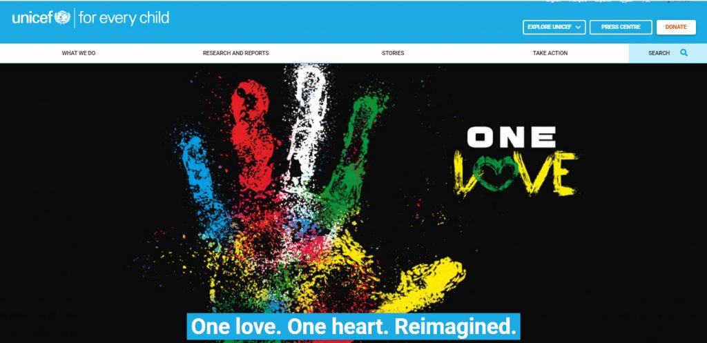
How UNICEF Increased Donations Using WordPress For Nonprofit Web Design
The Problem: Name Recognition Wasn’t Enough
Since 1946, UNICEF has operated around the world, working to provide humanitarian aid to children in need. The organization has high name recognition in multiple countries, but as UNICEF UK discovered, the high profile nature of the charity on its own was not enough to meet their goals for donations.
And the biggest obstacle they faced in developing more brand recognition was a bad user experience on their website.
The site itself had last been refurbished 6 years before, which resulted in over 4,000 pages of outdated, obsolete content & numerous technical issues.
In particular, the site was not optimized for mobile phones, a huge problem since an overwhelming majority of website visitors browse on their phones.
The site itself was also poorly organized, blending blog posts with main site content & causing mass confusion & frustration for visitors.
But that was only the tip of the iceberg. The Content Management System on the site was so difficult to use that UNICEF UK’s web administrators were actually apprehensive about optimizing it.
Furthermore, the website was the organization’s worst enemy when it came to getting the financial support they needed. When world disasters drew people to the site to donate, the spikes in traffic caused it to crash.
Clearly, there was a link between a lack of online engagement & donations, & the question of how to increase user engagement on websites had high stakes for UNICEF UK.
Enter WordPress, the same software Cirius Marketing uses to build websites that make money.

The Solution: Responsive Nonprofit Web Design
First of all…what are the benefits of WordPress? With so many web design platforms to choose from, what factors drove UNICEF UK’s decision toward this one?
* It’s easy to use. The software’s simple interface eliminated the web administrators’ anxiety over making adjustments to the site, resulting in an easier optimization process. * It’s well supported & easy to learn. With clear documentation of tutorials, trainings & tips, there’s no shortage of new things to learn about the technical aspects of the software for how to increase user engagement on websites.
* It’s customizable with room for creativity. The software can be easily adapted to fit a company’s purposes, which both templates & opportunities to create new layouts that fit their goals.
WordPress made it easy for UNICEF UK to not just create a better user experience on the technical end, but integrate the site with its donation platform to simplify the giving process even more.
With the site better equipped to handle high traffic periods & donation processing, UNICEF UK was freedom up to create compelling content that could truly build opportunities for emotional engagement & relationship building with visitors.
But most importantly, the numbers didn’t lie. The conversion rate among visitors more than doubled & within a month of launching the new site, UNICEF UK had received more online donations than at any point in the organization’s history.
And of course, all donations set aside, more people are now aware of the very real need of children across the world than ever before.
Why A Smarter Website Can Work For You
If you run a nonprofit organization, UNICEF UK’s story might give you some ideas about how to solve the technical challenges of how to increase user engagement on websites as you pursue options for nonprofit web design.
But if you run another kind of business, you still need a site that will enable visitors to engage & take actions that further their Customer Value Journey.
The challenges UNICEF UK’s website faced—technical glitches, a lack of engaging content, crashes—aren’t exclusive to nonprofit web design. And it takes experts in smarter websites to tackle them so you can grow your business.
Cirius Marketing has a patented formula for creating websites that generate leads, turn them into customers & allow them to experience every stage of the Value Journey as they move through your site.
WordPress is clearly a successful platform for business growth online, & it’s just one of many tools we have to generate the same success for your product or service.
We’d love to answer your questions about web design. Just drop an email to hello@ciriusmarketing.com or call 855-607-7766 to learn more.
In the meantime….grab your One Size Fits All Website Template to learn the 7 elements our formula uses to make websites that win.
