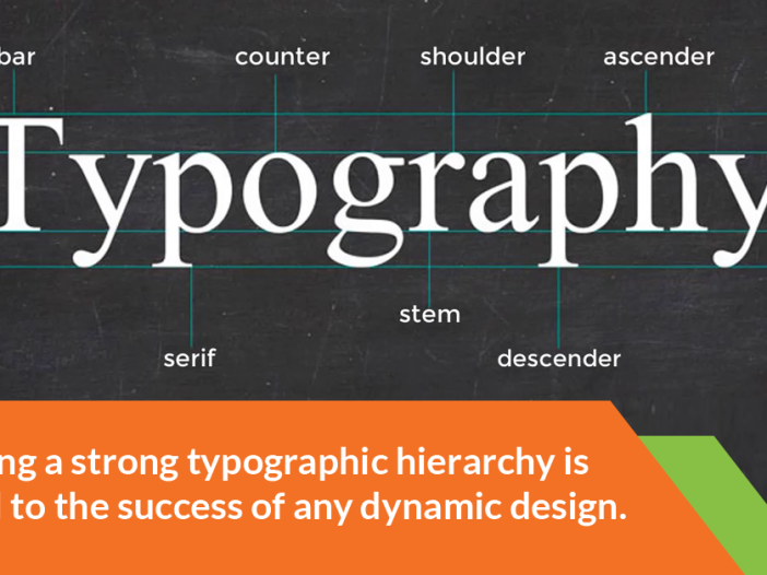
Creating a strong typographic hierarchy is crucial to the success of any dynamic design.
It’s the difference between effectively sharing an important message and putting a road-block of meaningless text in front of your readers.
If you can learn to use the core visual cues such as typeface, color and white space to organize your text elements, you’ll virtually guarantee the proper emphasis for your content and create that all-important focus on your message.
1. Limit Your Typefaces
Don’t use too many. Keep in mind that the goal of creating hierarchy is clarity.
Using two typefaces for one design is a safe standard. Why? Unless done carefully, combining more than two typefaces can have a distracting and cluttered effect. An interesting font always pairs well with a neutral font—one for headings and one for body. Tossing another into the mix could throw off the visual cues that lead the eye through the design.
2) Complement and Contrast
Pairing serifs and sans-serifs is a ubiquitous principle of design.
This is because the complex, interesting and often elegant serifs mesh well with the simple, clear sans serifs, creating effortless hierarchy without causing tension. Use one for headings and one for smaller copy. Be careful if you do decide to pair two serifs or two sans serifs — typefaces from the same classification usually end up in limbo between complementing and contrasting.
Don’t lean too far toward contrast, because choosing two fonts with vivid personalities can be distracting.
3) Be mindful of tone
It’s not always enough to pair a serif and a sans-serif together. They have to accomplish the same goal. Avoid pairing a serious serif with a playful sans serif, or a decorative serif with a rigid sans serif. Ask yourself what personality each typeface conveys in the context of your work, and if that personality is in accord with your overall message.
4) Employ strategic sizing
When it comes to type, it’s survival of the biggest and boldest.
If your main point is the same size as the body text or is surrounded by other big and bold elements, viewers will probably move on before grasping it. In order to really pack a punch with your main point, make the difference between it and the surrounding copy drastic. Choose a font with weight to really give your key information priority.
Because fonts scale differently and sizing can be tricky, you want to be careful about enlarging or minimizing certain fonts.
For example, minimizing a decorative display typeface such as Thirsty Script will, at a point, make it hard to read and unprofessional in appearance. However, you can use some body fonts to make elegant headlines. For example, Open Sans is an excellent body copy choice, but can work well for a headline if it’s light or extra bold.
5) Contrast colors
Color can be used to both classify information and add personality.
But the pop of color does more than tell your viewer where to look — it influences his or her emotional perception. Colors are attached to emotions, and are traditionally associated with different qualities. Implication is an aspect of visual hierarchy.
By using hot pink, you are conveying a tone along with your message that your viewer may perceive as playful, sassy, sensual or intense.
You can use color to enhance the mood that the copy and typography already convey, or you can use it to lend a new meaning to those elements. Consider not only the type, but the background color and the colors of other elements as well.
6) Watch the whitespace
Another aspect of giving a message its due emphasis is using whitespace — the space between text.
A design crammed with busy texy is not likely to have a clear hierarchy, even if you follow the rest of these rules. Most people won’t even take the trouble to read it. You must give enough space to elements so that they are easier to parse individually and the overall design appears clean.
Using whitespace doesn’t mean your content has to be sparse or simple.
It means taking the best advantage of the space you’re given and using it wisely. Proper use of whitespace will allow you to fit the necessary amount of content while helping the viewer locate the focal point of your design. Whitespace is more than empty space — it’s a cue that plays an important role in creating visual hierarchy.
Written by Katherine Halek
Recommended Reading: Elements of Design: Creating the Optimal Website
