
Responsive websites are incredibly common, largely because people are using their mobile devices to connect to the Internet at an increasing rate.
Although keeping up with technology is important, some business owners might not know exactly what a responsive website is and how to use it.
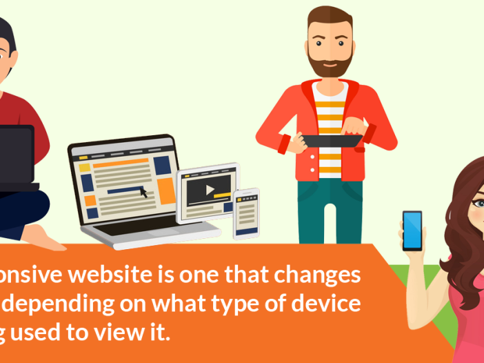
What is a responsive website?
A responsive website is one that changes its size depending on what type of device is being used to view it.
Since viewing devices can range from a four-inch smartphone screen to a 17-inch desktop monitor or larger, there’s a lot of variation to consider. Since smartphones and tablets are continuing to grow in popularity, there is going to be a continuing need for this trend well into the foreseeable future.
What is the purpose of a responsive website?
The main reason to have a responsive website is to have a site that responds differently depending on the type of device that is being used.
This drastically improves the ergonomic function of your customer’s experience. For example, a website that is being viewed on a large desktop monitor might have a completely different layout when it is being viewed on a smartphone.
If the layout does not change to accommodate the smaller screen, the viewer would likely need to scroll horizontally or some elements might be distorted or not be able to be seen at all.
By using responsive design, images are redesigned to make viewing less complicated for the user.
How does a responsive website work?
In order for a responsive website to work properly, it needs to use fluid grids rather than pixels. This change allows the elements on the pages to be sized by proportion. Therefore, when the size of one element is changed, everything else changes to remain in proportion with it. Images are also changed so they don’t become distorted.
Aspects to Consider:
Mouse vs. Touch
The change from using a mouse to navigating a site via touch can be tricky.
Desktop and laptop computers are generally navigated using a mouse or touchpad whereas navigating a smartphone or tablet requires a physical touching of the screen.
Often times it is more difficult to navigate a phone or tablet because of this difference. When responsive websites are developed, this difference needs to be taken into consideration.
Graphics and Download Speed
Another issue that needs to be taken into consideration is download speed.
Since downloading can often take longer on a smartphone, fewer graphics should be displayed, as they can further slow down the downloading process. You don’t want to overload your visitors anyway.
Always present your information in a clear and concise format.
Technology is only moving forward. Businesses that don’t want to stagnate should jump on the responsive website bandwagon or risk being left in the dust.
Recommended Reading: Non-Responsive Websites: The Bad, The Really Bad, and The Ugly
[wp_social_sharing social_options=’facebook,twitter,googleplus,linkedin,pinterest’ facebook_text=’Share on Facebook’ twitter_text=’Share on Twitter’ googleplus_text=’Share on Google+’ linkedin_text=’Share on Linkedin’ icon_order=’f,t,g,l’ show_icons=’0′ before_button_text=” text_position=’l’ social_image=”]